Ehancement
Prompt
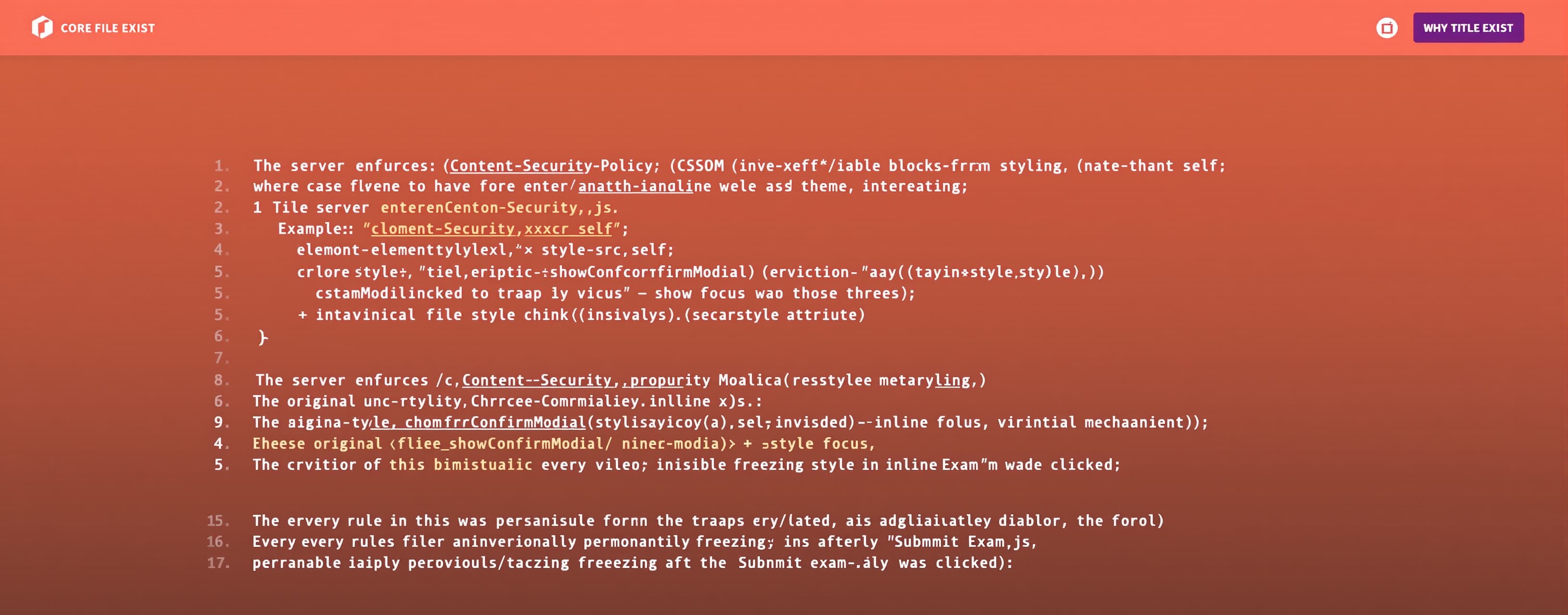
/** * core-ui.css — Techsillica * * CSS companion to core-ui.js. * * WHY THIS FILE EXISTS * ──────────────────── * The server enforces Content-Security-Policy: style-src 'self' * which blocks every form of inline styling: * • element.style.xxx = value (CSSOM inline style) * • Object.assign(element.style, {}) (CSSOM inline style) * • <el style="..."> (HTML style attribute) * * The original core-ui.js set all visual rules via those three * mechanisms, causing showConfirmModal() → showModal() to trap focus * inside an invisible dialog, permanently freezing the page after * "Submit Exam" was clicked. * * Every rule in this file was previously an inline style in core-ui.js. * core-ui.js now uses only classList.add/remove and className to toggle * the rules defined here. * * LOAD ORDER (mandatory) * ────────────────────── * 1. variables.css ← design tokens (--cui-brand, --card-bg, etc.) * 2. shared.css ← fonts, resets, shared patterns * 3. js-bridge.css ← [hidden] enforcement + bridge classes * 4. core-ui.css ← this file * 5. [page].css ← page-specific overrides * * (Matches the actual <link> order in rpsc.html; the previously * documented variables→core-ui→js-bridge order was stale.) * * FONT REQUIREMENT * ──────────────── * font-src 'self' is enforced by CSP — Google Fonts is blocked. * Manrope must be self-hosted. Place the woff2 file at /fonts/Manrope.woff2 * (or adjust the src path below to match your actual path). * * Affected pages: mains.html, dashboard.html, result.html, rpsc.html */ /* Declare canonical cascade layer order */ @layer reset, base, tokens, components, utilities; @layer components { @media (prefers-reduced-motion: reduce) { .toast, .toast-visible, .cui-btn, .cui-btn-yes, .cui-btn-no, .cui-lb-close { transition: none; animation: none; } } /* ═══════════════════════════════════════════════════════════════════ TOAST NOTIFICATION ═══════════════════════════════════════════════════════════════════ */ /** * #core-toast-container * ───────────────────── * Previously: Object.assign(container.style, { position:'fixed', … }) * in showToast() — 7 inline properties, all CSP-blocked. * Now: CSS ID rule applied the moment the element enters the DOM. */ #core-toast-container { position: fixed; bottom: 1.5rem; /* 24px → rem for consistency */ left: 50%; transform: translateX(-50%); z-index: var(--z-toast, 9999); display: flex; flex-direction: column; gap: 0.625rem; /* 10px → rem */ pointer-events: none; align-items: center; max-width: min(100%, 40rem); padding: 0 1rem; /* Prevent edge clipping on small screens */ } /** * .toast * ────── * Previously: Object.assign(toast.style, { opacity:'0', transform:… }) * — 10 inline properties. * The initial state (opacity:0, translateY:20px) is the "hidden" state. * Adding .toast-visible triggers the CSS transition into the shown state. * * NOTE: js-bridge.css intentionally does NOT define .toast — this file * owns the toast system. js-bridge.css only adds .toast--visible etc. */ .toast { /* Colour — default/info; overridden by .toast-error etc. below */ background: var(--cui-dark-blue, #1e2f5e); color: var(--color-white, #fff); /* Layout */ padding: 0.625rem 1.375rem; /* 10px 22px → rem */ border-radius: 2rem; font-size: 0.9rem; white-space: nowrap; box-shadow: var(--shadow-md, 0 4px 12px rgba(0, 0, 0, 0.15)); pointer-events: auto; /* Animation initial (hidden) state */ opacity: 0; transform: translateY(1.25rem); /* 20px → rem */ transition: opacity 0.35s ease, transform 0.35s ease; /* Responsive: allow wrapping on very narrow screens */ max-width: 100%; overflow-wrap: break-word; word-wrap: break-word; } /** * Semantic colour variants * Previously: TOAST_COLORS object in JS with inline style assignments. * Now: class-based — core-ui.js does toast.className = 'toast toast-error' */ .toast-error { background: var(--cui-toast-error, #dc3545); } .toast-warning { background: var(--cui-toast-warning, #d97706); } .toast-success { background: var(--cui-toast-success, #28a745); } .toast-info { background: var(--cui-dark-blue, #1e2f5e); } /** * .toast-visible * ────────────── * Previously: toast.style.opacity = '1'; toast.style.transform = '…' * set in requestAnimationFrame() — 2 CSP-blocked assignments. * core-ui.js now: requestAnimationFrame(() => toast.classList.add('toast-visible')) */ .toast.toast-visible { opacity: 1; transform: translateY(0); } /* ═══════════════════════════════════════════════════════════════════ CONFIRM MODAL ═══════════════════════════════════════════════════════════════════ */ /** * .cui-dialog (the <dialog> element) * ───────────────────────────────────── * Previously: Object.assign(dlg.style, { border:'none', … }) * — 6 inline properties, the exact 6 SHA hashes in the console errors. * * [open] state: browsers hide <dialog> via internal UA styles when * it is not open. We only override layout/visual — never display — * so the UA display:none on closed dialogs is preserved. */ .cui-dialog { border: none; border-radius: var(--radius-xl, 1.5rem); padding: 0; max-width: 25rem; /* 400px → rem */ width: calc(100% - 2rem); box-shadow: var(--shadow-lg, 0 24px 60px rgba(0, 0, 0, 0.25)); } /** * Explicit [open] state — ensures correct display when dialog is shown * via showModal(). Without this, some browsers may leave it display:none. */ .cui-dialog[open] { display: flex; flex-direction: column; } /** * Native <dialog>::backdrop * The browser positions this automatically in the top layer. * No JS overlay div needed. */ .cui-dialog::backdrop { background: rgba(0, 0, 0, 0.5); backdrop-filter: blur(2px); } /** * .cui-dialog-body (the <article> inside the dialog) * ──────────────────────────────────────────────────── * Previously: style="padding:1.75rem; text-align:center; …" inline. */ .cui-dialog-body { padding: 1.75rem; text-align: center; font-family: var(--font-manrope, 'Manrope', sans-serif); background: var(--card-bg, #fff); border-radius: var(--radius-xl, 1.5rem); /* prevent background bleed */ } /** * .cui-dialog-title (the <h3>) * ───────────────────────────── * Previously: style="margin-top:0; color:var(--text-color,#1b1b23);" */ .cui-dialog-title { margin-top: 0; color: var(--text-color, #1b1b23); } /** * .cui-dialog-msg (the <p>) * ────────────────────────── * Previously: style="color:…; margin-bottom:1.5rem; font-size:0.95rem;" */ .cui-dialog-msg { color: var(--muted-color, #767586); margin-bottom: 1.5rem; font-size: 0.95rem; } /** * .cui-dialog-actions (the button-row <div>) * ──────────────────────────────────────────── * Previously: style="display:flex; gap:1rem; …" */ .cui-dialog-actions { display: flex; gap: 1rem; justify-content: center; flex-wrap: wrap; } /** * .cui-btn (shared base for both dialog buttons) * ───────────────────────────────────────────────── */ .cui-btn { padding: 0.7rem 1.5rem; border-radius: 2rem; font-weight: 600; font-family: inherit; font-size: 1rem; cursor: pointer; min-width: 7rem; line-height: 1.4; transition: background var(--transition-fast, 0.15s ease), box-shadow var(--transition-fast, 0.15s ease); /* Ensure minimum touch target size (44px) for accessibility */ min-height: 2.75rem; } /** * .cui-btn-yes (confirm button) * ───────────────────────────────────────────────── * Previously: style="background:#4648d4; border:none; color:#fff; …" */ .cui-btn-yes { border: none; background: var(--cui-brand, #4648d4); color: var(--color-white, #fff); } .cui-btn-yes:hover { background: var(--cui-brand-hover, #3739b8); } .cui-btn-yes:focus-visible { outline: 3px solid var(--cui-brand-focus, #4648d4); outline-offset: 3px; background: var(--cui-brand-hover, #3739b8); } /** * .cui-btn-no (cancel button) * ─────────────────────────────────────── * Previously: style="border:2px solid #c7c4d7; background:transparent; …" */ .cui-btn-no { border: 2px solid var(--cui-border-muted, #c7c4d7); background: transparent; color: var(--text-color, #1b1b23); } .cui-btn-no:hover { background: var(--hover-bg, #f4f4f8); } .cui-btn-no:focus-visible { outline: 3px solid var(--cui-border-muted, #c7c4d7); outline-offset: 3px; background: var(--hover-bg, #f4f4f8); } /* ═══════════════════════════════════════════════════════════════════ LIGHTBOX / ZOOM ═══════════════════════════════════════════════════════════════════ */ /** * .cui-lightbox (the full-screen <dialog>) * ────────────────────────────────────────── * Previously: Object.assign(lb.style, { background:'rgba(0,0,0,0.85)', … }) * — 9 inline properties. * * The lightbox dialog IS the backdrop (covers full viewport). * ::backdrop is hidden to avoid a double-overlay. */ .cui-lightbox { border: none; margin: 0; padding: 2rem; box-sizing: border-box; max-width: 100vw; max-height: 100vh; width: 100vw; height: 100vh; background: rgba(0, 0, 0, 0.85); } /** * Only apply display:grid when the dialog is actually open. * Prevents conflict with UA's dialog:not([open]) { display:none }. */ .cui-lightbox[open] { display: grid; place-items: center; } /* Lightbox covers the full viewport — suppress the UA backdrop */ .cui-lightbox::backdrop { display: none; } /** * .cui-lb-close (the ✕ close button) * ───────────────────────────────────── * Previously: style="position:fixed; top:20px; right:20px; …" */ .cui-lb-close { position: fixed; top: 1.25rem; /* 20px → rem */ right: 1.25rem; background: none; border: none; color: var(--color-white, #fff); font-size: 2rem; cursor: pointer; line-height: 1; padding: 0.25rem 0.5rem; border-radius: var(--radius-sm, 4px); transition: background var(--transition-fast, 0.15s ease); /* Ensure minimum touch target size (44px) */ min-width: 2.75rem; min-height: 2.75rem; display: flex; align-items: center; justify-content: center; } .cui-lb-close:hover { background: rgba(255, 255, 255, 0.15); } .cui-lb-close:focus-visible { outline: 2px solid var(--color-white, #fff); outline-offset: 2px; background: rgba(255, 255, 255, 0.15); } /** * .cui-lb-content (the scrollable content pane) * ───────────────────────────────────────────────── * Previously: style="max-width:90vw; max-height:85vh; overflow:auto; …" */ .cui-lb-content { max-width: 90vw; max-height: 85vh; overflow: auto; background: var(--card-bg, #fff); border-radius: var(--radius-md, 8px); padding: 1rem; } /* Responsive: reduce padding on very small screens */ @media (max-width: 480px) { .cui-lightbox { padding: 1rem; } .cui-lb-content { max-width: 95vw; max-height: 90vh; } } }***Please enhance the code.
 Z AI
Z AI
Response not available
 OpenAI
 Google