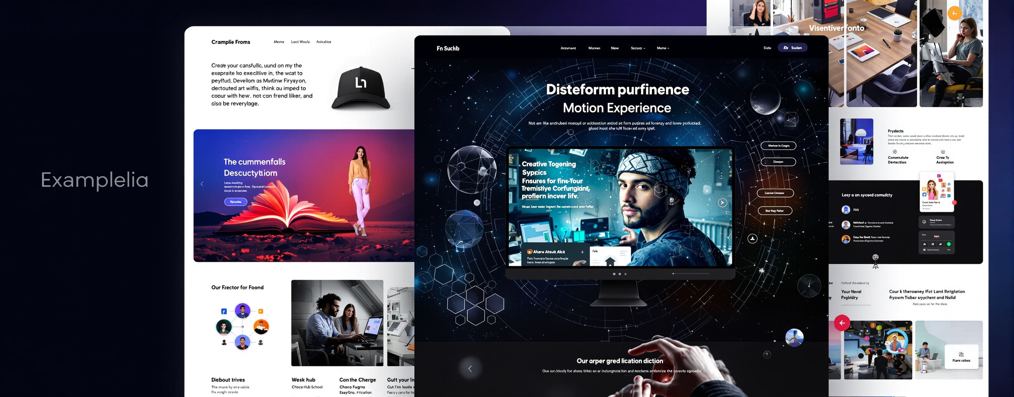
Create my personal portfolio website as a NEXT-LEVEL, multi-...
Prompt
Create my personal portfolio website as a NEXT-LEVEL, multi-page MOTION EXPERIENCE — not a traditional portfolio, not a template, and definitely not just a collection of sections. You are not only a developer here. Think like a world-class creative developer, interaction designer, motion designer, art director and UX engineer working together. IDENTITY Name: Suhaib Role: Creative Developer Email: craftworldtool@gmail.com PROJECTS • Workskio • Choco Hub • Funngro • EasyGrow • Web Lab IMPORTANT PRIVACY RULE: Do NOT include my age, school, birthday, photograph, location, or unnecessary personal identity information. CORE VISION Build a website where the WEBSITE ITSELF becomes the portfolio. The visitor should not simply scroll through information. They should EXPERIENCE it. I want the reaction to be: “Wait… what just happened?” “Is this actually a portfolio?” “Okay, I need to explore this.” Create a strong visual language that feels original, intentional and premium. MULTI-PAGE ARCHITECTURE Create a genuinely multi-page experience such as: / → Entry / Home experience /about → Identity, thinking & capabilities /work → Project universe /work/workskio → Workskio case study /work/choco-hub → Choco Hub case study /work/funngro → Funngro case study /work/easygrow → EasyGrow case study /experiments → Interactive experiments / creative lab /process → How I think and build /contact → Final interaction You may introduce additional pages if they improve the experience. IMPORTANT: Do not make every page look like the same template with different text. Every major page should have its own visual rhythm while still belonging to the same universe. HOME EXPERIENCE The homepage should immediately establish Suhaib's creative identity. Instead of a normal: “Hi, I'm Suhaib” create a cinematic opening sequence with typography, movement and spatial composition. Use elements that react to: • scrolling • mouse movement • touch • hover • navigation • section transitions Typography itself can become an interface. Words can move, split, transform, overlap, disappear, reappear or transition into the next section. ABOUT EXPERIENCE Do not create a boring biography. Turn the About page into an interactive explanation of how I think and create. Use ideas such as: THINK → CREATE → BUILD → EXPERIMENT → REFINE Allow the typography, layout and sections to transform as the visitor explores. Keep the actual information professional and concise. WORK EXPERIENCE Projects should NOT be ordinary cards in a grid. Create a project exploration system. As the visitor moves through projects: • layouts transform • typography changes • project visuals react • sections pin and release • navigation updates • transitions connect one project to another Each project should feel like entering a different chapter. CASE STUDIES For every major project, create a complete visual case-study experience. Include: • project introduction • concept • problem / objective • what was created • UI/UX decisions • technology / skills • interactive preview • process • final result • transition to the next project Do not fill space with unnecessary paragraphs. Make information easy to scan while the motion provides the storytelling. EXPERIMENTS / CREATIVE LAB Create a page that feels like entering a digital playground. Show experimental interactions, motion studies, UI experiments, creative components or small interactive concepts. They don't need to be huge applications. The purpose is to demonstrate that I don't only build websites — I experiment with interfaces. MOTION LANGUAGE Push motion much further than normal portfolio animations. Explore: • cinematic page transitions • smooth scrolling • scroll-driven transformations • kinetic typography • text masking • character-by-character reveals • clip-path transitions • pinned storytelling • horizontal movement • parallax depth • scale transformations • perspective • magnetic interactions • cursor-responsive elements • touch-responsive elements • hover morphing • image displacement • section-to-section continuity • navigation morphing • animated progress indicators • micro-interactions • loading choreography • subtle ambient movement BUT: Do NOT turn it into animation soup. The site must remain readable, fast and elegant. Every major animation should have a reason. THE “WOW” MOMENTS Create several moments that feel unexpected. For example: A project title could transform into the project page. A section could visually fold into the next section. A giant piece of typography could become navigation. Scrolling could temporarily change the composition rather than simply moving the page upward. The cursor could subtly influence specific objects. A project transition could feel like entering another environment. A hidden interaction could reward exploration. Use your own creative judgement to invent moments like these. Do NOT copy these examples literally if you have a better idea. VISUAL STYLE Keep the UI: • minimal • editorial • premium • spacious • modern • highly readable • visually confident Use a controlled color system rather than throwing gradients everywhere. Avoid: • generic AI portfolio aesthetics • excessive glassmorphism • giant unnecessary 3D objects • particle explosions • rainbow gradients • excessive borders • huge amounts of text • meaningless animations • template-looking cards I want sophisticated simplicity. The complexity should come from the INTERACTION, not visual clutter. RESPONSIVE EXPERIENCE Desktop and mobile must feel intentionally designed. Desktop can use: • cursor interactions • hover states • horizontal sections • larger compositions • deeper spatial movement Mobile should have its own interaction logic: • touch gestures • tap interactions • swipe-friendly sections • simplified motion where necessary • carefully controlled viewport usage Never simply shrink the desktop design. PERFORMANCE Because this is a motion-heavy website, performance is extremely important. Optimize: • animations • images • JavaScript • rendering • scroll listeners • asset loading Prefer transform/opacity-based animation where appropriate. Respect prefers-reduced-motion. Do not sacrifice usability for visual effects. NAVIGATION Create a navigation system that feels like part of the experience. Include: • smooth page transitions • active page indication • mobile menu • project navigation • clear way back • browser Back/Forward support CRITICAL: The browser's normal Back and Forward buttons must work perfectly. Never trap the visitor inside custom navigation. TECHNICAL REQUIREMENTS Actually build the complete website. Do NOT: • stop at a design concept • give me only a landing page • create fake buttons • leave placeholder sections • provide pseudo-code • tell me how I could build it Build the real working implementation. Use a clean component architecture and reusable motion systems where appropriate. FINAL QA Before considering the project finished, thoroughly test: ✓ Every route ✓ Every internal link ✓ Project navigation ✓ Browser Back ✓ Browser Forward ✓ Direct URL loading ✓ Page refresh ✓ Mobile navigation ✓ Touch interactions ✓ Mouse interactions ✓ Hover states ✓ Scroll animations ✓ Page transitions ✓ Responsive layouts ✓ 320px → 1440px+ screens ✓ Reduced-motion mode ✓ Console errors ✓ Broken assets ✓ Performance problems Fix issues instead of simply mentioning them. FINAL CREATIVE DIRECTION Do not ask me to choose between ten design directions. Make strong creative decisions yourself. Push the concept as far as you can while keeping it usable. The goal is NOT: “Make a beautiful portfolio.” The goal is: “Create a digital experience so memorable that the visitor remembers the WEBSITE before they remember the portfolio content.” Make it feel like a website from the future of creative development — while still being clean, human, readable and professionally usable. Build it. Test it. Polish it. Then make it even better.
A system prompt was added to support web rendering

Response not available
 OpenAI
 Google