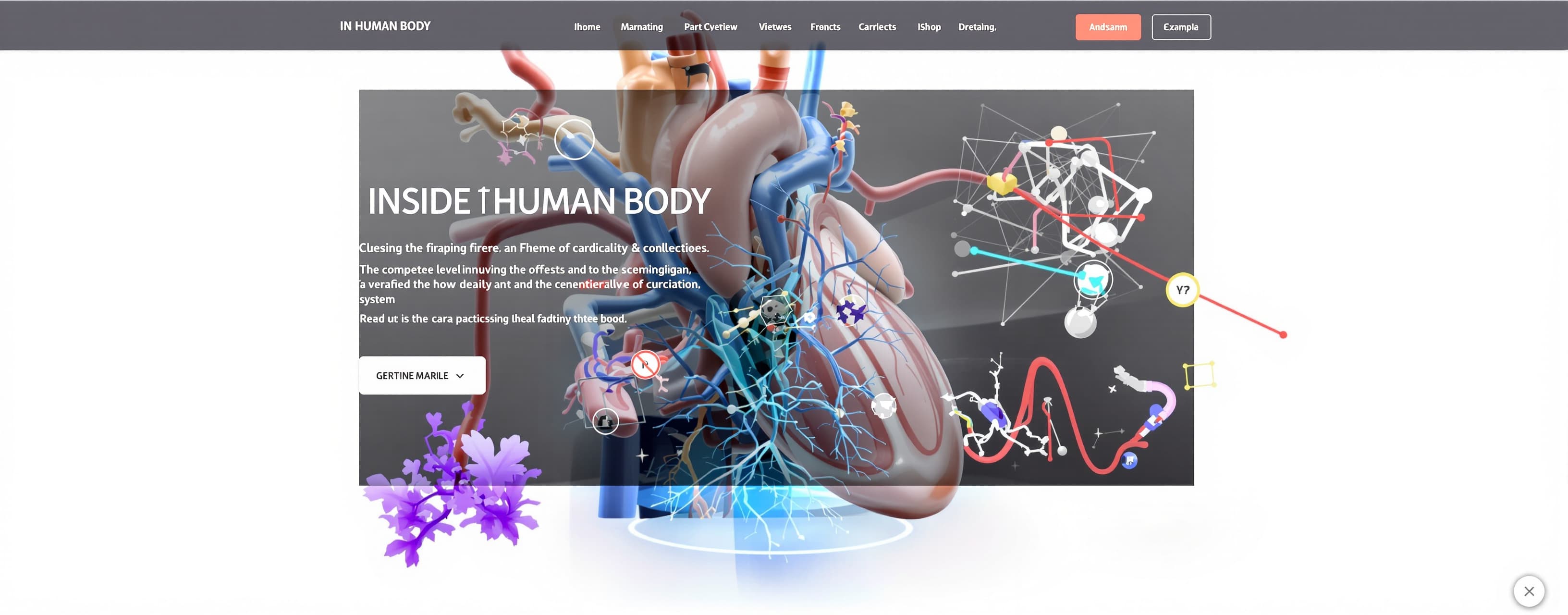
test
Prompt
Build a complete, production-quality interactive 3D medical storytelling website called “INSIDE THE HUMAN BODY”. This is a stress test of your highest-level frontend, UI/UX, WebGL/Three.js, animation, interaction, responsive design, accessibility and performance capabilities. DO NOT create a generic healthcare landing page, hospital website, SaaS dashboard, static mockup, collection of cards, or fake prototype. Build an immersive cinematic educational experience where the visitor travels through the cardiovascular system using scroll-driven 3D storytelling. TECH STACK Use the existing project framework if available. Otherwise use React + TypeScript + Vite/Next.js. Use Three.js, preferably React Three Fiber + Drei where appropriate. Use GSAP and/or Framer Motion for animation. Use modern CSS, SVG and WebGL shaders only where useful. Keep the architecture modular. Do not put the entire application into one component. Suggested structure: components/ navigation/ storytelling/ anatomy/ visualizations/ annotations/ quiz/ ui/ 3d/ scenes/ camera/ materials/ effects/ data/ hooks/ utils/ styles/ DESIGN DIRECTION Create a premium digital-science / cinematic-documentary aesthetic inspired by world-class interactive museum and scientific visualization experiences. Visual language: - near-black / graphite environment - restrained crimson biological accents - subtle oxygen-inspired secondary accent - sophisticated editorial typography - modern sans-serif for UI - oversized typography only at important narrative moments - thin scientific annotation lines - tiny technical labels - scale indicators - subtle grids - atmospheric depth Avoid: - generic blue healthcare templates - excessive gradients - excessive glassmorphism - neon cyberpunk - random glowing cards - giant rounded cards everywhere - meaningless particles - excessive shadows - decorative effects with no purpose The interface should feel expensive because of precision and restraint. CORE 3D EXPERIENCE The central visual is an anatomically-inspired 3D human heart and vascular system. Create or procedurally construct a convincing educational approximation if no anatomical model is available. The heart should have: - realistic volume - anatomical complexity - branching vessels - subtle tissue-like material - controlled translucency/Fresnel - soft cinematic lighting - organic movement - sophisticated depth Do NOT make it cartoonish, plastic, chrome or emoji-like. Clearly treat it as an educational visualization rather than clinical imaging. The heart continuously performs a subtle realistic cardiac pulse. The deformation must be organic, not robotic. Create a WebGL environment with: - cinematic camera - controlled lighting - rim light - atmospheric fog - subtle depth - restrained particles - anatomical hotspots - animated blood flow Integrate WebGL and HTML into one composition. It must not feel like a canvas sitting behind a normal website. SCROLL STORYTELLING Scrolling is the primary storytelling mechanism. Create one normalized scroll-progress state and use it to coordinate: - camera position - camera rotation - camera target - anatomical transforms - model opacity - blood-flow speed - lighting - particles - annotations - typography - section transitions Do not simply move HTML sections upward. The camera should physically travel through the 3D environment. Use smooth damping, interpolation, anticipation and carefully chosen easing. NARRATIVE CHAPTER 01 — ENTER Begin in near darkness. A distant slowly pulsing heart appears. Display: INSIDE THE HUMAN BODY “Every heartbeat is a journey.” Small instruction: SCROLL TO ENTER As scrolling begins, the camera slowly approaches the heart. CHAPTER 02 — THE HEART Arrive close to the heart. Display: “Four chambers. Two circuits. One continuous loop.” Reveal major external structures using precise scientific annotations. Keep the interface minimal. CHAPTER 03 — FOUR CHAMBERS Make the external heart increasingly translucent and allow the camera to enter. Reveal: - right atrium - right ventricle - left atrium - left ventricle Highlight each sequentially. Allow users to click/tap a chamber and smoothly focus the camera on it. Example explanation: LEFT VENTRICLE “The chamber that generates the pressure required to send oxygen-rich blood throughout the body.” Keep educational copy concise. CHAPTER 04 — BLOOD FLOW Turn circulation into an animated living system. Show: RIGHT ATRIUM → RIGHT VENTRICLE → PULMONARY ARTERY → LUNGS → PULMONARY VEINS → LEFT ATRIUM → LEFT VENTRICLE → AORTA → BODY Implement flowing particles or curve-based animation. Oxygen-poor and oxygen-rich blood should be visually distinguishable using multiple cues, not color alone. Include direction indicators and labels. CHAPTER 05 — OXYGEN Travel conceptually from heart to lungs. Transition from organ scale to vessel/micro scale. Create a scientifically responsible educational visualization of oxygen exchange. Show: oxygen entering bloodstream carbon dioxide leaving bloodstream Use animated particles and directional pathways. Do not fake microscopic clinical imagery. CHAPTER 06 — THROUGH THE VESSELS Move through an increasingly branching vascular network. The viewer should feel as though they are traveling through a vessel. Use flowing blood particles and branching geometry. Add a subtle scale indicator to communicate the transition toward microcirculation. CHAPTER 07 — UNDER LOAD Return to the heart. Start in a resting state. Then transition into exercise. As exercise begins: - heart rhythm increases - blood flow accelerates - visual activity increases subtly - relevant data changes Show a conceptual REST vs EXERCISE visualization. Example: REST Typical adult resting heart rate: 60–100 bpm EXERCISE Heart rate generally increases as physical demand rises. Clearly state that these are general educational values, not personalized medical advice. CHAPTER 08 — WHEN THE SYSTEM CHANGES Introduce simplified educational visualizations of: - coronary artery disease - hypertension - arrhythmia - heart failure For each show: - what it is - what changes - a simplified visual mechanism Avoid frightening imagery and diagnosis language. CHAPTER 09 — KNOWLEDGE TEST Build a genuinely functional quiz. Example: Which chamber pumps oxygen-rich blood into systemic circulation? A. Right atrium B. Right ventricle C. Left atrium D. Left ventricle On selection: - indicate correct/incorrect - animate the relevant anatomy - explain the answer - allow continuation No fake buttons. FINAL CHAPTER — THE LOOP Return to the complete cardiovascular system. Create one connected animated loop: BODY ↓ VEINS ↓ RIGHT HEART ↓ LUNGS ↓ LEFT HEART ↓ ARTERIES ↓ BODY Finish with: “One heartbeat. One continuous journey.” Provide: - restart experience - chapter navigation NAVIGATION Create a minimal persistent navigation system containing: - brand - chapter number - chapter name - overall progress - sound toggle - reduced-motion toggle - information control Do not make it look like a conventional website navbar. Use a slim floating system or vertical chapter rail. Chapters: 01 ENTER 02 HEART 03 CHAMBERS 04 BLOOD FLOW 05 OXYGEN 06 VESSELS 07 EXERCISE 08 HEALTH 09 TEST 10 THE LOOP Users can jump between chapters. Navigation must synchronize with the 3D state. ANATOMICAL HOTSPOTS Create precise interactive hotspots for structures. Hotspots should: - subtly pulse - respond to hover - respond to keyboard focus - reveal labels - use thin leader lines - open/focus educational information Avoid giant glowing circles. Use a scientific technical-visualization style. On mobile, simplify leader lines and use anchored labels/bottom sheets. 3D CONTROLS During anatomy sections support: - orbit - constrained rotation - controlled zoom - hover/tap selection - camera focus - reset camera Animate camera focusing rather than snapping. Prevent extreme zoom/rotation. Desktop pointer movement can create subtle parallax/light response, but never make the anatomy chase the cursor. CUSTOM CURSOR Desktop only. Normal: small precise point. Interactive: slight expansion. Do not make it distracting. MOTION SYSTEM Create a coherent motion language with separate timing for: - micro interactions - UI transitions - section transitions - cinematic camera movement Use different easing intentionally. Use staggered text reveals and controlled transitions. Do not animate everything. Motion must establish hierarchy and communicate the story. VISUALIZATIONS Build meaningful interactive visualizations: 1. four-chamber flow 2. circulation pathway 3. oxygen exchange 4. vessel branching 5. rest vs exercise Each visualization must teach something. Do not add charts purely for decoration. MATERIALS + SHADERS Use sophisticated materials: - subtle Fresnel - tissue-like response - controlled translucency - soft highlights - vessel differentiation - atmospheric depth Where appropriate, implement custom shaders for: - blood flow - tissue response - particles - atmospheric effects Use post-processing sparingly: - subtle bloom - vignette - optional depth-of-field Keep anatomy and typography sharp. PERFORMANCE Performance is a core requirement. Implement: - lazy loading - code splitting - optimized textures - sensible DPR limits - adaptive particle counts - device capability detection - reduced effects on weak hardware - lazy initialization - efficient animation loops - proper Three.js disposal - no memory leaks - minimal per-frame calculations If WebGL is unavailable, provide a functional 2D/SVG/text fallback. Do not leave a blank canvas. MOBILE Design mobile specifically; do not simply shrink desktop. On mobile: - reduce particles - reduce post-processing - simplify 3D - replace hover with tap - use bottom sheets - simplify chapter navigation - keep anatomy centered - preserve readable typography - preserve narrative flow Support portrait screens and sensible landscape behavior. TOUCH Support: - tap - drag/orbit - controlled pinch zoom Do not allow 3D gestures to make normal page scrolling frustrating. ACCESSIBILITY Implement real accessibility: - semantic HTML - heading hierarchy - keyboard navigation - visible focus states - ARIA labels where necessary - accessible buttons - screen-reader-readable educational content - keyboard-accessible anatomy - accessible quiz - sufficient contrast Support prefers-reduced-motion. When reduced motion is enabled: - remove cinematic camera travel - minimize 3D animation - use fades/static transitions - preserve every piece of information - preserve functionality SOUND Sound is optional. Never autoplay audio. Include a sound toggle. Optional audio: - subtle heartbeat - atmospheric ambience - restrained UI feedback Never require sound to understand the experience. Handle browser autoplay restrictions. LOADING EXPERIENCE Create a cinematic loading state rather than a generic spinner. Example: CALIBRATING ANATOMY LOADING EXPERIENCE Use subtle pulse/progress animation. Do not show a blank screen while assets load. CONTENT Use concise, scientifically responsible educational language. Do not use lorem ipsum. Do not invent medical statistics. Do not make personalized health claims. Include a subtle disclaimer: “Educational visualization only. This experience is not a substitute for professional medical advice, diagnosis, or treatment.” EDITORIAL QUALITY The experience should feel like one continuous authored journey. Example transition: “The heart is a pump.” The heart appears beside the statement. Continue scrolling. Typography recedes. Camera approaches. Heart becomes translucent. Internal anatomy emerges. Annotations appear. Camera enters the chamber. Blood begins moving. The text and anatomy must feel spatially connected. Do not make the visitor feel like they are simply scrolling through cards. DESIGN SYSTEM Create reusable components for: - buttons - labels - annotations - information panels - tooltips - progress indicators - quiz states - modals - bottom sheets - loading - errors Use CSS design tokens for: - colors - spacing - typography - borders - radii - shadows - animation durations Avoid arbitrary values scattered throughout the codebase. RESPONSIVE TYPE Use fluid typography with clamp() where appropriate. Maintain readable line lengths. Use responsive spacing. Do not merely scale desktop layouts. SEO Add: - meaningful title - meta description - Open Graph metadata - semantic headings - accessible page structure ERROR HANDLING If: - 3D asset fails - WebGL fails - shader fails - audio fails - animation initialization fails the educational experience must still work. Provide graceful fallback states. Do not create dead UI. QUALITY BAR The final website should feel as if it was created by: - a senior creative director - senior Three.js/WebGL engineer - interaction designer - medical educator - accessibility specialist - performance engineer working together. Do not confuse complexity with quality. A working advanced interaction is better than ten fake effects. Prioritize: 1. functionality 2. storytelling 3. interaction 4. 3D visualization 5. visual refinement 6. accessibility 7. performance 8. maintainability FINAL QA Before finishing, verify: - project builds - TypeScript passes - no broken imports - no obvious console/runtime errors - WebGL initializes - heart pulse works - scroll-driven camera works - chapter navigation works - hotspots work - camera focus works - reset works - blood flow works - visualizations work - quiz works - sound toggle works - reduced motion works - keyboard navigation works - mobile works - touch works - WebGL fallback works - failed assets have graceful handling - Three.js resources are disposed - no obvious performance problems - every interactive element actually works If testing tools are available, use them. Do not stop after building the hero. Build the complete experience. Do not return a tutorial. Do not return a proposal. Do not describe what could be built. Do not provide pseudocode. Do not create fake functionality. BUILD THE ACTUAL WORKING WEBSITE NOW.
A system prompt was added to support web rendering
 OpenAI
Response not available
 Alibaba
 AnthropicOpenAI