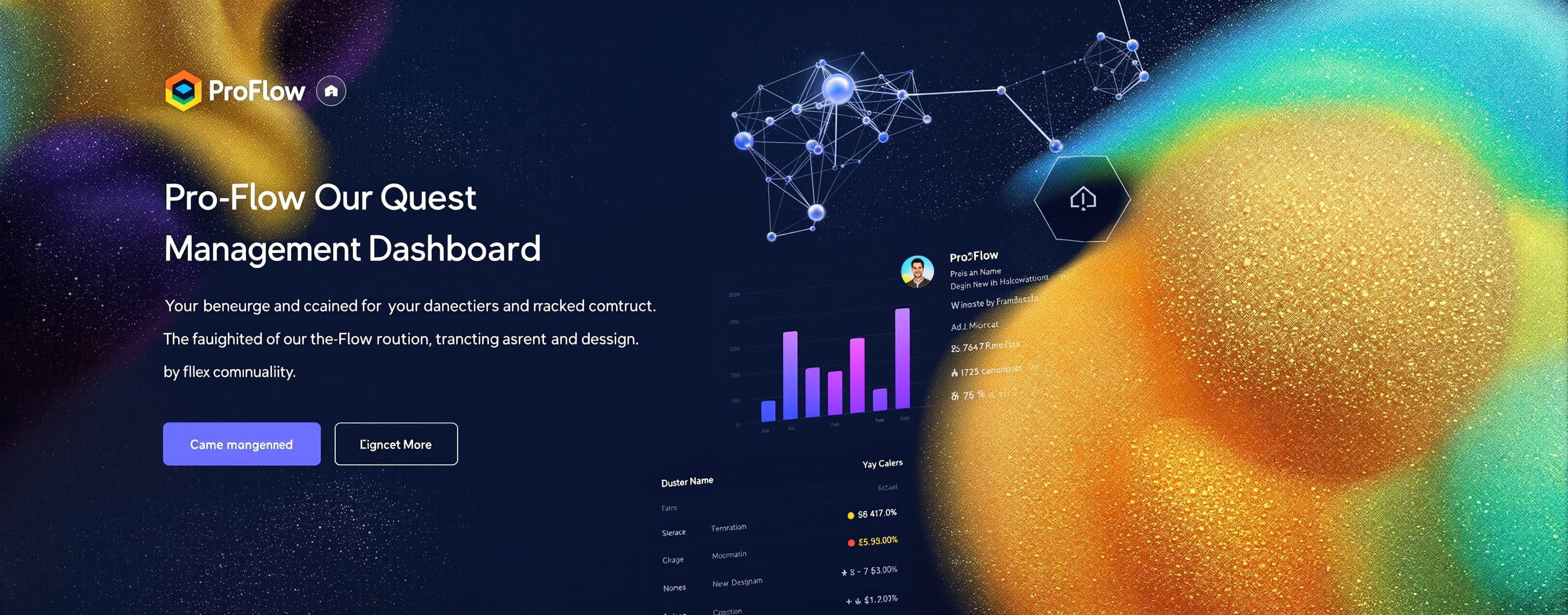
test
Prompt
Build a fully functional, production-ready Frontend Application — a Real-Time Project Management Dashboard with the following complete specifications. Write all code in a single HTML file with embedded CSS and JavaScript (no external frameworks except where specified via CDN). The application must be visually stunning, fully interactive, and demonstrate advanced frontend engineering skills. ═══════════════════════════════════════════════════════════ APPLICATION NAME: "ProFlow — Real-Time Project Management Dashboard" ═══════════════════════════════════════════════════════════ ━━━━━━━━━━━━━━━━━━━━━━━━━━━━━━━━━━━━━━━━━━━━━━━━━━━━━━━━━ SECTION 1: OVERALL DESIGN SYSTEM ━━━━━━━━━━━━━━━━━━━━━━━━━━━━━━━━━━━━━━━━━━━━━━━━━━━━━━━━━ Design Philosophy: - Modern Glassmorphism + Neumorphism hybrid design - Dark mode as default with a toggle for light mode - Fully responsive: Mobile (320px), Tablet (768px), Desktop (1440px) - Smooth animations on every interaction (no janky transitions) - Micro-interactions on hover, click, drag, and drop Color Palette (Dark Mode): - Background: #0a0e1a (deep navy) - Surface: #111827 (card background) - Glass Effect: rgba(255,255,255,0.05) with backdrop-filter blur(20px) - Primary Accent: #6366f1 (indigo) - Secondary Accent: #8b5cf6 (violet) - Success: #10b981 (emerald) - Warning: #f59e0b (amber) - Danger: #ef4444 (red) - Text Primary: #f9fafb - Text Secondary: #9ca3af - Border: rgba(255,255,255,0.1) Typography: - Font: Inter (load from Google Fonts CDN) - Heading sizes: 32px, 24px, 20px, 16px - Body: 14px - Small/Labels: 12px Animations Required: - Page load: Staggered fade-in + slide-up for all cards (delay each by 100ms) - Hover on cards: Subtle scale(1.02) + glow shadow effect - Button clicks: Ripple effect - Modal open/close: Scale + fade animation - Sidebar: Smooth collapse/expand with icon-only mode - Number counters: Animate from 0 to target value on load - Chart bars/lines: Draw animation on load - Drag and drop: Ghost element + snap-back animation - Notifications: Slide in from top-right, auto-dismiss with progress bar - Theme toggle: Smooth color transition across entire page (transition: all 0.4s) ━━━━━━━━━━━━━━━━━━━━━━━━━━━━━━━━━━━━━━━━━━━━━━━━━━━━━━━━━ SECTION 2: LAYOUT STRUCTURE ━━━━━━━━━━━━━━━━━━━━━━━━━━━━━━━━━━━━━━━━━━━━━━━━━━━━━━━━━ Overall Layout: ┌─────────────────────────────────────────────────────┐ │ TOP NAVBAR │ ├──────────┬──────────────────────────────────────────┤ │ │ │ │ SIDEBAR │ MAIN CONTENT AREA │ │ │ │ │ ├──────────────────────────────────────────┤ │ │ BOTTOM STATUS BAR │ └──────────┴──────────────────────────────────────────┘ TOP NAVBAR (fixed, 64px height): - Left: Hamburger menu icon (toggles sidebar) + App Logo "ProFlow" with animated gradient text - Center: Global search bar with: * Placeholder: "Search projects, tasks, team members..." * On focus: Expands width with smooth animation * Shows dropdown with categorized live search results (fake data) * Keyboard shortcut hint: "Ctrl+K" * Search icon that spins on typing - Right section (left to right): * "Add New" button with "+" icon (opens quick-add modal) * Notification bell with animated badge showing count (pulsing red dot) * Dark/Light mode toggle (sun/moon icon with smooth morph animation) * User avatar (circular, with online status green dot) * User dropdown menu on click: Profile, Settings, Help, Logout SIDEBAR (collapsible, 260px expanded / 70px collapsed): - Top: Workspace selector dropdown (shows "Acme Corp ▾") - Navigation sections with icons and labels: MAIN NAVIGATION: ▸ Dashboard (grid icon) — ACTIVE STATE ▸ Projects (folder icon) ▸ My Tasks (checkmark icon) — with badge showing "12" ▸ Calendar (calendar icon) ▸ Team (users icon) ▸ Reports (bar-chart icon) ▸ Time Tracking (clock icon) PROJECTS (collapsible sub-section): ▸ Website Redesign (colored dot: blue) ▸ Mobile App v2 (colored dot: purple) ▸ Marketing Campaign (colored dot: green) ▸ API Integration (colored dot: orange) ▸ + Add Project SETTINGS: ▸ Integrations ▸ Settings ▸ Help & Support - Bottom: Storage usage progress bar (68% used) - Active state: Highlighted with gradient background + left accent border - Hover state: Subtle background fill animation (slides in from left) - Collapsed mode: Show only icons with tooltips on hover ━━━━━━━━━━━━━━━━━━━━━━━━━━━━━━━━━━━━━━━━━━━━━━━━━━━━━━━━━ SECTION 3: MAIN DASHBOARD PAGE (Default View) ━━━━━━━━━━━━━━━━━━━━━━━━━━━━━━━━━━━━━━━━━━━━━━━━━━━━━━━━━ ROW 1 — PAGE HEADER: - Title: "Good morning, Alex 👋" (time-aware: changes based on actual time) - Subtitle: "Here's what's happening with your projects today." - Right side: Date display (e.g., "Monday, January 15, 2025") + "Generate Report" button ROW 2 — KPI METRIC CARDS (4 cards in a grid): Card 1 — Total Projects: - Icon: folder (indigo background circle) - Value: "24" (animate counter from 0) - Label: "Total Projects" - Sub-info: "+3 this month" in green with up arrow - Sparkline mini-chart (7 data points, line graph) Card 2 — Tasks Completed: - Icon: checkmark circle (green background) - Value: "1,284" - Label: "Tasks Completed" - Sub-info: "↑ 12% vs last month" - Circular progress ring: 78% with animated stroke-dashoffset Card 3 — Team Members: - Icon: users (purple background) - Value: "38" - Label: "Active Members" - Sub-info: "4 new this week" - Show 5 small overlapping avatar circles Card 4 — Hours Logged: - Icon: clock (amber background) - Value: "3,847" - Label: "Hours Logged" - Sub-info: "↓ 2% vs last month" in red - Sparkline mini-chart Each card: - Glassmorphism style - Gradient left border (3px) - Hover: lift effect + glow - Click: Ripple animation ROW 3 — TWO COLUMN LAYOUT: LEFT COLUMN (65% width) — Project Progress Tracker: - Section title: "Active Projects" with "View All →" link - Tab switcher: [All] [In Progress] [Review] [Completed] - List of 5 project cards, each containing: * Color-coded left border * Project name (bold) * Project description (1 line, truncated) * Progress bar (animated fill, gradient color) with percentage * Deadline badge: (e.g., "Due Jan 30" — color-coded: green=on track, yellow=at risk, red=overdue) * Team avatar stack (3-4 overlapping avatars) * Priority badge: [HIGH] [MEDIUM] [LOW] with colors * Three-dot menu button (shows: Edit, Archive, Delete options) * Task count: "24/36 tasks" Projects data (use this): 1. Website Redesign | 72% | Due Feb 10 | HIGH | 5 members 2. Mobile App v2 | 45% | Due Jan 25 | HIGH | 8 members 3. Marketing Campaign | 89% | Due Jan 20 | MEDIUM | 4 members 4. API Integration | 31% | Due Mar 5 | LOW | 3 members 5. Brand Guidelines | 95% | Due Jan 18 | MEDIUM | 2 members RIGHT COLUMN (35% width): Top: "Team Activity Feed" (live-updating fake simulation): - List of 8 activity items with: * User avatar (colored initials) * Action description: "Sarah completed 'Design mockups' in Website Redesign" * Timestamp: "2 min ago", "15 min ago", etc. * Action type icon (check=completed, comment=commented, upload=uploaded) - Auto-updates every 5 seconds with a new simulated activity (fades in from top) - "Load more" button Bottom: "Upcoming Deadlines" widget: - Title: "Due This Week" - 5 deadline items: * Task name * Project name (colored tag) * Days remaining (badge: red if <2 days, yellow if <5 days, green otherwise) * Assignee avatar - Scrollable list ROW 4 — CHARTS ROW (3 charts): Chart 1 — Task Completion Trend (60% width): - Type: Area chart (line chart with gradient fill underneath) - X-axis: Last 7 days (Mon-Sun) - Y-axis: Number of tasks (0-50) - Data: [28, 35, 22, 41, 38, 45, 32] - Two lines: "Completed" (indigo) and "Created" (purple) — both with area fill - Legend below chart - Hover tooltip showing exact values - Animated draw from left to right on load - All drawn with pure SVG (no chart library) Chart 2 — Project Status Donut (20% width): - Type: Donut/Ring chart - Segments: On Track (45%, green), At Risk (30%, yellow), Overdue (15%, red), Completed (10%, gray) - Center text: "24 Total" - Animated: Each segment draws in sequence - Legend below with colored dots - Hover: Segment slightly expands outward + tooltip Chart 3 — Team Workload Bar Chart (20% width): - Type: Horizontal bar chart - Shows 5 team members with their task load - Data: Alex (85%), Sarah (72%), Mike (60%), Lisa (45%), Tom (90% — overloaded, shown in red) - Bars animate width from 0 to value - Color: green <70%, yellow 70-85%, red >85% All charts: Pure CSS/SVG/Canvas — do NOT use Chart.js or any chart library. ROW 5 — KANBAN BOARD PREVIEW: - Section title: "Task Board — Website Redesign" with "Open Full Board →" link - 4 columns: [To Do] [In Progress] [Review] [Done] - Each column shows column title + task count badge - Each column contains 3-4 draggable task cards: * Task title * Priority badge * Due date * Assignee avatar * Subtask count: "3/5 subtasks" * Tag chips (e.g., "Design", "Frontend", "Bug") - DRAG AND DROP fully functional between columns * Drag: Card gets slight rotation + shadow + opacity 0.7 * Drop target: Column highlights with dashed border * Successful drop: Card bounces into position * Column counts update dynamically - "Add Task" button at bottom of each column (opens modal) ━━━━━━━━━━━━━━━━━━━━━━━━━━━━━━━━━━━━━━━━━━━━━━━━━━━━━━━━━ SECTION 4: INTERACTIVE MODALS ━━━━━━━━━━━━━━━━━━━━━━━━━━━━━━━━━━━━━━━━━━━━━━━━━━━━━━━━━ MODAL 1 — Add New Task: Triggered by: "Add New" button or Kanban "Add Task" Contains: - Modal header: "Create New Task" + close button (X) - Form fields: * Task Title (text input — required, shows character count 0/100) * Description (textarea — auto-expands as you type) * Project (custom dropdown with color dots) * Status (segmented control: To Do / In Progress / Review / Done) * Priority (three toggle buttons: 🔴 High / 🟡 Medium / 🟢 Low — visually selected) * Assignees (multi-select with avatar chips, searchable) * Due Date (custom date picker with calendar popup) * Estimated Hours (number input with +/- stepper) * Tags (tag input — type and press Enter to add, click X to remove) * Attachments (drag-and-drop file zone or click to upload — shows file preview) - Footer: "Cancel" button + "Create Task" button (shows loading spinner on click, then success state) - Backdrop click closes modal - ESC key closes modal - Form validation: Real-time, shows inline error messages MODAL 2 — Notification Panel: Triggered by: Bell icon Slide-in panel from right (not centered modal): - Header: "Notifications" + "Mark all read" + "Settings" icon - Filter tabs: [All] [Mentions] [Updates] [Deadlines] - Notification list (10 items): * Each: Avatar + message + time + unread blue dot * Types: Task assigned, Comment added, Deadline approaching, File uploaded, Status changed * Hover: Background highlight + "Mark read" action appears * Swipe left (on mobile): Reveal delete button - Empty state illustration when all read - Footer: "View all notifications →" MODAL 3 — User Profile Dropdown: - Small dropdown (not full modal) - User info: Avatar + Name + Email + Role badge - Quick stats: "12 tasks", "3 projects" - Menu items with icons - Status selector: 🟢 Online / 🟡 Away / 🔴 Busy / ⚫ Invisible - Theme selector within dropdown (redundant with navbar but good UX) ━━━━━━━━━━━━━━━━━━━━━━━━━━━━━━━━━━━━━━━━━━━━━━━━━━━━━━━━━ SECTION 5: ADVANCED INTERACTIVE FEATURES ━━━━━━━━━━━━━━━━━━━━━━━━━━━━━━━━━━━━━━━━━━━━━━━━━━━━━━━━━ 1. GLOBAL SEARCH (Ctrl+K shortcut): - Pressing Ctrl+K opens search bar in focused state - Dropdown shows: * Section: "Recent" — 3 recent items * Section: "Projects" — filtered project results with icons * Section: "Tasks" — filtered task results * Section: "Team Members" — filtered member results with avatars - Keyboard navigation: Arrow keys move selection, Enter opens item - Escape closes dropdown 2. REAL-TIME CLOCK in status bar: - Shows current time updating every second (HH:MM:SS format) 3. LIVE ACTIVITY SIMULATION: - Every 8 seconds, a new activity appears in the feed - Notification badge count increments - Toast notification slides in from top-right 4. TOAST NOTIFICATION SYSTEM: - Four types: Success (green), Error (red), Warning (yellow), Info (blue) - Each has: Icon + Title + Message + close button + auto-dismiss progress bar (5 seconds) - Stack multiple notifications vertically - "Undo" action button on relevant toasts 5. DARK/LIGHT MODE: - Complete theme switch for ALL elements - Light mode palette: White backgrounds, dark text, lighter shadows - Transition: All colors transition smoothly over 0.4 seconds - Preference saved to localStorage 6. RESPONSIVE BEHAVIOR: - Mobile (<768px): * Sidebar becomes bottom tab bar * KPI cards stack to 2x2 grid * Charts stack vertically * Kanban scrolls horizontally * Modals become full-screen bottom sheets - Tablet (768px-1024px): * Sidebar collapses to icon-only automatically * 2-column layout adjusts to single column 7. KEYBOARD SHORTCUTS PANEL: - Press "?" to open a modal showing all keyboard shortcuts - Shortcuts include: Ctrl+K (search), N (new task), B (board view), ESC (close modal) 8. DRAG TO REORDER: - Project list in sidebar can be reordered by dragging - KPI cards can be reordered 9. INLINE EDITING: - Click on any project name in the project list to edit it inline - Press Enter to save, Escape to cancel - Show edit icon on hover to indicate editability 10. CUSTOM SCROLLBAR: - Thin, styled scrollbar (4px wide, rounded, matches accent color) - Appears only on hover of scrollable containers ━━━━━━━━━━━━━━━━━━━━━━━━━━━━━━━━━━━━━━━━━━━━━━━━━━━━━━━━━ SECTION 6: BOTTOM STATUS BAR (fixed, 28px height) ━━━━━━━━━━━━━━━━━━━━━━━━━━━━━━━━━━━━━━━━━━━━━━━━━━━━━━━━━ Left: 🟢 "All systems operational" | "v2.4.1" Center: Live clock (HH:MM:SS) Right: "38 members online" | "Last synced: just now" (updates every 30s) ━━━━━━━━━━━━━━━━━━━━━━━━━━━━━━━━━━━━━━━━━━━━━━━━━━━━━━━━━ SECTION 7: TECHNICAL REQUIREMENTS ━━━━━━━━━━━━━━━━━━━━━━━━━━━━━━━━━━━━━━━━━━━━━━━━━━━━━━━━━ CODE REQUIREMENTS: - Single HTML file (index.html) - CSS: Embedded in <style> tag — use CSS custom properties (variables) for theming - JavaScript: Embedded in <script> tag — Vanilla JS only (no React, Vue, Angular) - Allowed CDNs: Google Fonts (Inter) only - NO jQuery, NO Bootstrap, NO Tailwind, NO Chart.js - All charts: Hand-coded SVG or Canvas - All icons: Inline SVG (hand-coded or SVG path strings — do NOT use icon libraries) - All data: Hardcoded JavaScript objects/arrays (no API calls) PERFORMANCE REQUIREMENTS: - Use CSS transforms instead of position changes for animations - Use requestAnimationFrame for smooth JS animations - Debounce search input (300ms)
A system prompt was added to support web rendering
 OpenAI
 Kimi
Kimi