Redesign the website at https://www.lauriehannoush.com/ from...
Prompt
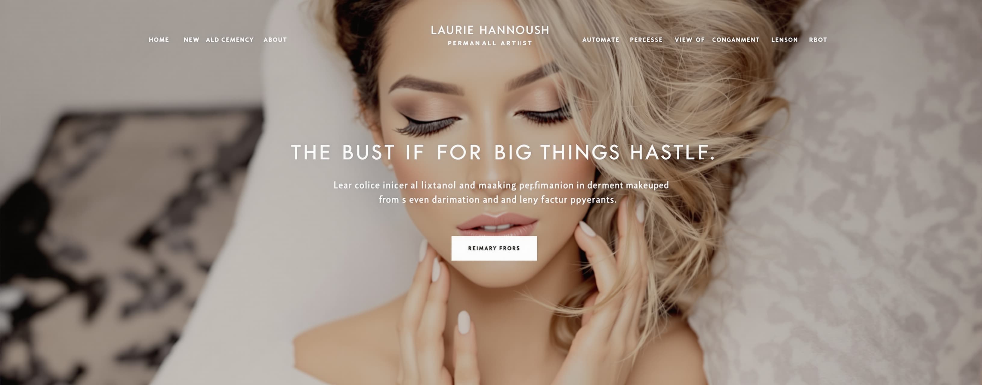
Redesign the website at https://www.lauriehannoush.com/ from the ground up into a **high-end, luxurious, conversion-focused permanent makeup website** for Laurie Hannoush, a professional PMU artist based in Frisco, Texas. Do NOT make this look like a generic Squarespace template. The current website feels dated, visually weak, and overly spaced out. Create something that feels like a premium beauty studio brand — elegant, editorial, feminine, sophisticated, and highly trustworthy. ## PRIMARY GOAL The primary goal is to get visitors to **book a PMU appointment**. Every section should build toward that conversion: **Beautiful result → trust → expertise → desire → booking.** The website should immediately communicate: * Premium permanent makeup * Highly skilled, meticulous artistry * Natural, beautiful results * Luxury experience * Professionalism and trust * Strong social proof * Easy booking Avoid clutter, excessive text, generic stock photography, unnecessary animations, and huge empty spaces. --- # VISUAL DIRECTION Create a sophisticated luxury beauty aesthetic. ### Color palette * Warm ivory / soft cream background * Deep espresso / near-black typography * Warm taupe and beige accents * Subtle muted gold accents * Plenty of negative space, but use it intentionally ### Typography Use a sophisticated editorial serif for major headlines and an elegant modern sans-serif for body text and navigation. The typography should feel similar to a luxury beauty/fashion editorial rather than a corporate website. Large, confident headlines. Short paragraphs. Excellent typography hierarchy. ### Overall feeling Think: **Luxury PMU studio + Vogue beauty editorial + modern high-end skincare brand.** It should feel expensive without becoming flashy. Use: * Large photography * Full-bleed imagery * Elegant serif headlines * Subtle borders * Soft rounded corners where appropriate * Refined micro-interactions * Gentle image reveals * Smooth scrolling * Minimal animation Do NOT overuse rounded cards, gradients, glassmorphism, neon colors, or trendy SaaS-style UI. --- # NAVIGATION Create a clean sticky navigation: **Laurie Hannoush** Services Results About FAQs Contact Primary CTA: **BOOK NOW** The Book Now button should remain visually prominent throughout the site. On mobile, use a clean hamburger menu with a highly visible **Book Now** CTA. --- # HERO SECTION Create an immediately impressive hero section. Use a beautiful high-quality image of Laurie and/or a stunning PMU result as the main visual. Headline: **Wake Up With Beautiful Brows.** Supporting copy: **Luxury permanent makeup designed to enhance your natural beauty — so you can spend less time getting ready and more time feeling confident.** Primary CTA: **BOOK YOUR APPOINTMENT** Secondary CTA: **VIEW RESULTS** Add a subtle trust line underneath: **Brows • Lip Blush • Eyeliner** The hero should feel spacious and luxurious, but NOT empty. Use an asymmetrical editorial layout rather than a basic centered hero. --- # TRUST / SOCIAL PROOF STRIP Immediately below the hero, add a refined credibility section. Example: **Trusted for precision, artistry & natural-looking results** Then include: ★★★★★ **5-star client experience** Use actual testimonials from the existing website rather than inventing reviews. Feature a short testimonial such as: “Laurie is the only person I trust to do my lips and brows. Do yourself a favour and book with her!” — Desiree Make this section visually elegant and compact. --- # SERVICES SECTION Create a visually stunning services section titled: **Your Beauty, Refined.** Supporting text: **Enhance the features you already love with permanent makeup tailored to your face, your style, and your desired result.** Create three premium service blocks: ### BROWS Natural-looking, beautifully defined brows designed to complement your features. CTA: **EXPLORE BROWS →** ### LIP BLUSH Soft, flattering color and definition for naturally beautiful-looking lips. CTA: **EXPLORE LIP BLUSH →** ### EYELINER Effortless definition that stays polished from morning to night. CTA: **EXPLORE EYELINER →** Use large photography for each service. Do not make these look like generic rectangular service cards. Make them feel editorial and image-led. --- # RESULTS / PORTFOLIO This should be one of the strongest sections on the entire site. Headline: **Results That Speak For Themselves.** Supporting text: **Every set is customized to enhance your natural features while creating a result that feels effortlessly you.** Create a premium image gallery showcasing actual PMU work. Prioritize: * Before / after brows * Lip blush results * Eyeliner * Close-up beauty photography Use a sophisticated masonry/editorial gallery. Images should be large enough to appreciate the actual results. Add a CTA: **SEE ALL RESULTS →** Do not hide the portfolio deep inside the site. PMU clients need to see the work before booking. --- # ABOUT LAURIE Create a premium personal-brand section. Headline: **Meet Laurie** Use a beautiful portrait of Laurie. Copy should communicate expertise, precision, artistry, and the personal experience clients receive. Use existing factual information from the current website where available. The section should make Laurie feel like a trusted expert rather than simply "someone who does brows." Include a CTA: **GET TO KNOW LAURIE →** --- # WHY CLIENTS CHOOSE LAURIE Create a refined benefits section with 3–4 points: **Precision & Detail** Every appointment is approached with meticulous attention to symmetry, shape, and balance. **Natural-Looking Results** Enhance your features without making them look overly done. **Personalized Approach** Your treatment is customized around your features, preferences, and desired outcome. **Professional Experience** A calm, comfortable experience from consultation through aftercare. Keep this section visually minimal. --- # TESTIMONIALS Create a beautiful testimonial section using the existing testimonials from the current website. Feature 3–5 reviews. Make the typography large and editorial. Example: “Laurie is the best at what she does. She's so meticulous and precise. I am obsessed with my brows.” — Kate Include multiple testimonials but don't overwhelm the visitor. --- # THE EXPERIENCE Create a section explaining what happens when someone books. Headline: **From Consultation to Confidence.** Create a simple 3-step process: ### 01 — CONSULTATION We discuss your goals, preferences, and the result you're looking for. ### 02 — CUSTOM DESIGN Your shape and treatment are carefully designed around your unique features. ### 03 — YOUR TRANSFORMATION Enjoy beautifully enhanced features designed to make your everyday routine easier. CTA: **BOOK YOUR CONSULTATION** This should reduce anxiety for first-time PMU clients. --- # FAQ Create a clean FAQ accordion. Include relevant questions such as: Is permanent makeup painful? How long does the appointment take? How long do results last? What is the healing process like? How should I prepare for my appointment? Can you correct previous permanent makeup? Use information from the existing website wherever possible. Do not invent medical claims. --- # FINAL CTA End with a visually dramatic, premium CTA section. Use a beautiful close-up PMU image or portrait. Headline: **Ready To Wake Up Beautiful?** Supporting text: **Let's create a look that feels effortlessly you.** Button: **BOOK YOUR APPOINTMENT** Secondary: **VIEW RESULTS** This section should feel like the natural conclusion of the entire sales journey. --- # FOOTER Minimal luxury footer. Laurie Hannoush PMU Brows • Lip Blush • Eyeliner Frisco, Texas 13030 Preston Rd #400 Frisco, TX 75035 +1 469-536-8534 Links: Services Gallery About FAQs Contact Book Now Include Instagram prominently. --- # CONVERSION REQUIREMENTS The site must be designed around conversion, not just aesthetics. Include clear CTAs throughout the page. Primary CTA: **BOOK YOUR APPOINTMENT** Secondary CTA: **VIEW RESULTS** The visitor should never have to search for how to book. Use sticky navigation. On mobile, consider a persistent bottom CTA: **BOOK YOUR APPOINTMENT** Make booking accessible within one tap. Build visual hierarchy so that the visitor naturally moves through: **Hero → Trust → Services → Results → Expertise → Testimonials → Experience → FAQ → Booking** --- # IMAGE DIRECTION Use the artist's existing photography and PMU results wherever possible. Do NOT replace genuine work with generic stock photos. Photography should feel: * Warm * Editorial * Luxurious * Clean * High-end * Beauty-focused Crop images carefully so faces and PMU results remain the focal point. Use subtle image hover effects on galleries. --- # UX / UI Desktop: * Maximum content width around 1200–1400px * Generous but intentional whitespace * Strong visual rhythm * Large photography * Editorial asymmetry * Sticky navigation Mobile: * Prioritize photography * Large readable typography * Short sections * Thumb-friendly buttons * No cramped layouts * Persistent booking CTA * Fast-loading images * Make before/after results easy to view --- # IMPORTANT Do NOT simply restyle the existing website. **Completely rethink the layout and information hierarchy.** The existing website has too much generic spacing and doesn't create enough desire to book. Replace that with a highly visual, emotionally persuasive experience. The final website should make a potential client think: **“Her work is beautiful. She clearly knows what she's doing. I trust her. I want these results. I should book.”** Every design decision should support that reaction. Make it look like a **$10,000 luxury beauty brand website**, not a $500 template.
A system prompt was added to support web rendering
 Alibaba
 Anthropic
 Kimi
Kimi