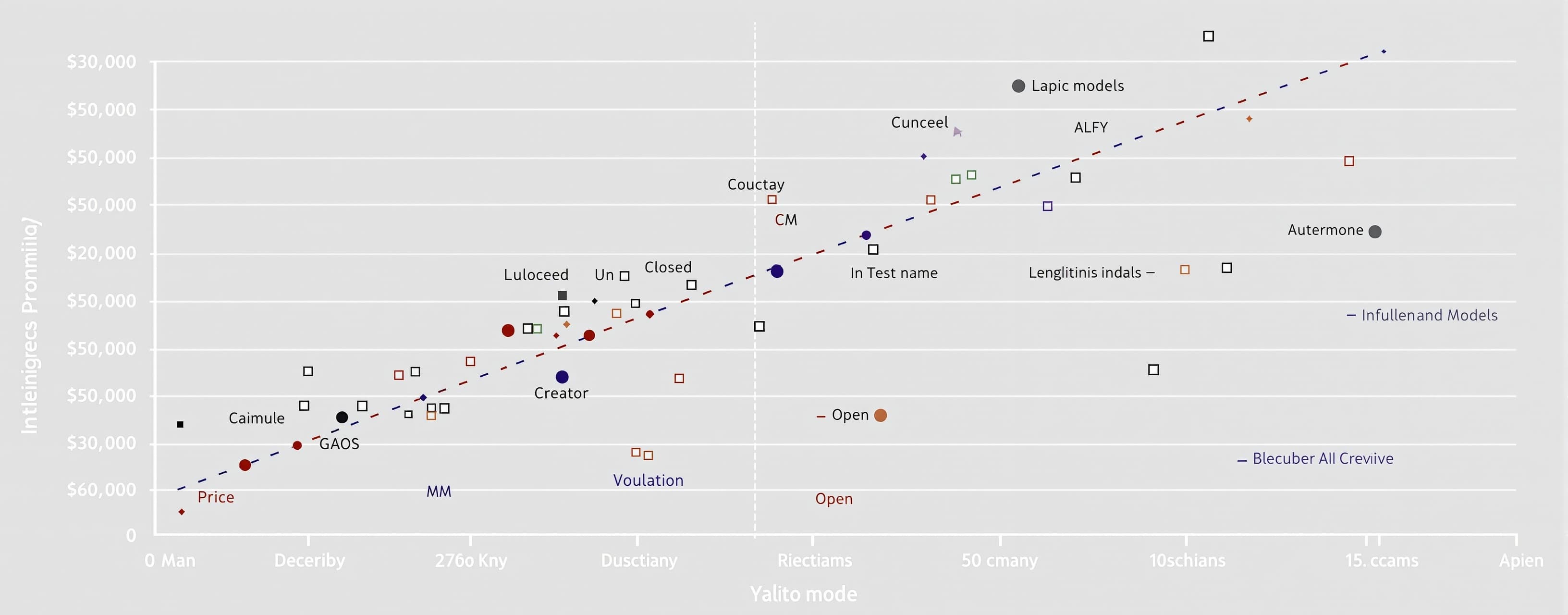
Plot an intelligence (y-axis) vs price (x-axis) chart of the...
Prompt
Plot an intelligence (y-axis) vs price (x-axis) chart of the data in this table: https://artificialanalysis.ai/leaderboards/models Color the dots by the name of the Creator. Add a dotted line that connects all of the models on the Pareto frontier for intelligence/cost efficiency. Annotate each of the models on the fronteir with their name. Annotate the "best" model for each creator as well. Make it an interactive local app where I can hover over them and see more details for each. Make the closed models filled square markers and the open ones open circles
A system prompt was added to support web rendering
 OpenAI
Drag to resize
OpenAIDrag to resize
 Z AI
Z AIDrag to resize
 Kimi
KimiDrag to resize