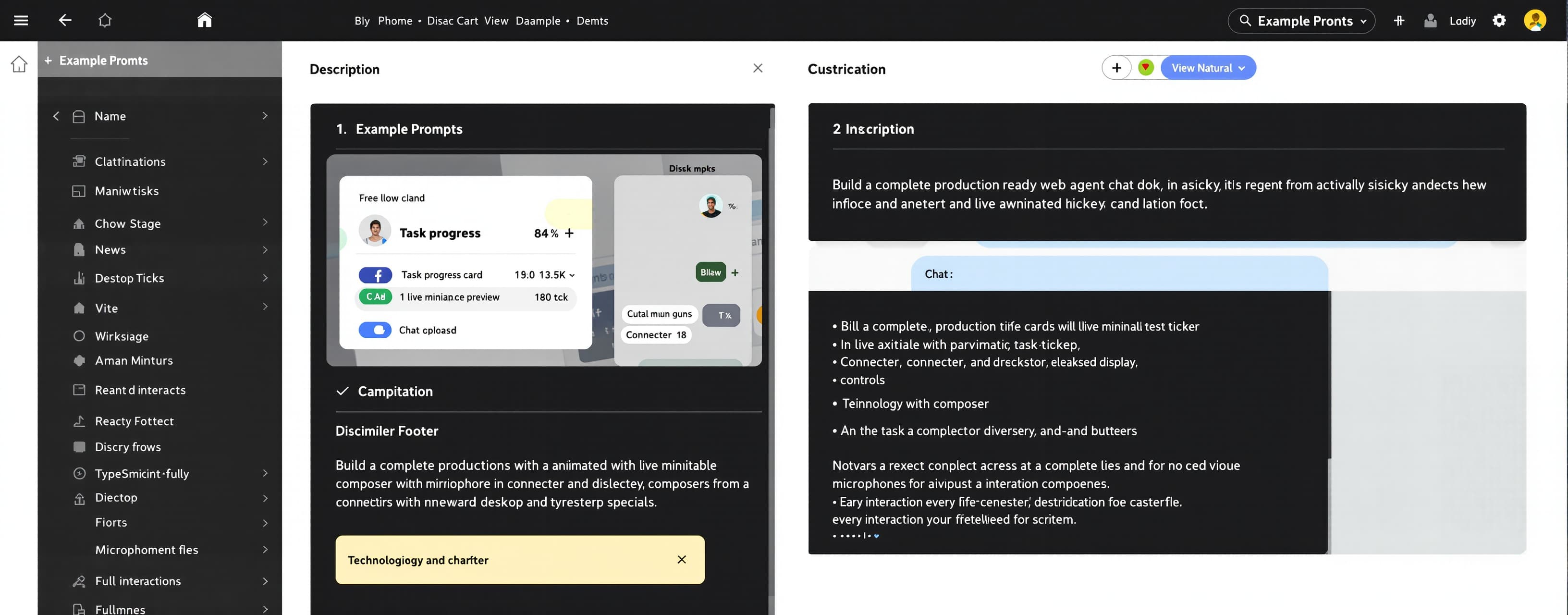
Build a complete, production‑ready web application from scra...
Prompt
Build a complete, production‑ready web application from scratch that implements an AI‑agent chat dock: a sticky, bottom‑anchored interface composed of (1) a collapsible task‑progress card with a live miniature workspace preview, an animated task ticker, elapsed‑time display, and pagination, (2) a rich‑text chat composer with attachment, connector, and desktop‑integration controls plus microphone and send/stop buttons, and (3) a disclaimer footer. Deliver the full project as an explicit file tree followed by the complete, unabridged contents of every file. No stubs, no TODOs, no placeholder components, no omitted logic, no truncated files. Every interaction described below must be fully implemented and functional. ## 1. Technology stack and scaffolding - Vite + React 18 + TypeScript in strict mode. - Tailwind CSS 3 with `darkMode: 'class'`, arbitrary‑value utilities, and logical‑property utilities (`ms-`, `ps-`, `pe-`, `start-`, `rtl:` variants). - `lucide-react` for all icons. - `@tiptap/react`, `@tiptap/starter-kit`, and `@tiptap/extension-placeholder` for the composer editor. - No component libraries; hand‑build every component and popover. Create exactly this file tree and output every file in full: ``` package.json vite.config.ts tsconfig.json tsconfig.node.json postcss.config.js tailwind.config.ts index.html src/main.tsx src/App.tsx src/index.css src/config.ts src/types.ts src/state/TaskEngine.tsx src/hooks/useNow.ts src/hooks/useDismiss.ts src/components/dock/AgentDock.tsx src/components/dock/GradientOverlay.tsx src/components/dock/TaskProgressCard.tsx src/components/dock/TaskRow.tsx src/components/dock/CanvasSpinner.tsx src/components/dock/MiniWorkspacePreview.tsx src/components/dock/Composer.tsx src/components/dock/ChatEditor.tsx src/components/dock/Popover.tsx src/components/dock/popovers/AttachmentMenu.tsx src/components/dock/popovers/ConnectorsMenu.tsx src/components/dock/popovers/DesktopMenu.tsx src/components/conversation/ConversationView.tsx ``` `package.json` must include all dependencies with pinned versions and scripts: `dev`, `build`, `preview`, `typecheck`. ## 2. Configuration - `src/config.ts`: export `AGENT_NAME = "Agent"` and `DEVICE_NAME = "Workstation Desktop"`. All user‑visible strings derive from these constants: editor placeholder `Ask ${AGENT_NAME} anything`, footer text `${AGENT_NAME} is an AI Agent and can make mistakes. Please double-check before use.`, desktop chip label `${DEVICE_NAME}`. - `tailwind.config.ts`: content globs for `index.html` and `src/**/*.{ts,tsx}`; `darkMode: 'class'`; no theme extensions that replace the CSS‑variable‑driven colors — reference variables directly via arbitrary values. ## 3. Design tokens and global styles (`src/index.css`) - Declare `@tailwind base; @tailwind components; @tailwind utilities;`. - Define a `:root` light theme and a `.dark` dark theme providing every one of these CSS variables with coherent, production‑quality values: `--background-gray-main`, `--background-card-gray`, `--background-menu-white`, `--menu-white`, `--border-main`, `--border-dark`, `--text-primary`, `--text-secondary`, `--text-tertiary`, `--text-disable`, `--text-onblack`, `--icon-secondary`, `--icon-tertiary`, `--icon-onblack`, `--Button-black`, `--fill-tsp-white-light`, `--fill-tsp-white-main`, `--shadow-XS`, `--shadow-S`, `--shadows-drop-2`. - Add a `.scrollbar-none` utility (hide scrollbars cross‑browser while keeping scrollability). - Add the TipTap placeholder rule: `p.is-editor-empty::before` renders `content: attr(data-placeholder)` in `var(--text-disable)`, floated, zero height, pointer‑events none. - Set the base font stack and `bg-[var(--background-gray-main)]` on `body`. ## 4. Data model and task engine (`src/types.ts`, `src/state/TaskEngine.tsx`) - `TaskStatus = 'pending' | 'running' | 'completed'`. - `AgentTask { id: string; title: string; status: TaskStatus; elapsedSeconds: number; plannedDurationSeconds: number; logLines: string[] }`. - Implement a real state engine via `useReducer` + React context with actions: `ENQUEUE(title, plannedDurationSeconds)`, `TICK`, `COMPLETE_ACTIVE`, `STOP_ACTIVE`, `SELECT_ACTIVE(index)`. - A single 1000 ms `setInterval` dispatches `TICK`, incrementing `elapsedSeconds` of every `running` task by 1; when a running task reaches its planned duration it transitions to `completed` and the next `pending` task auto‑starts. At most one task runs at a time. - `STOP_ACTIVE` marks the running task `completed` immediately. - The engine exposes `tasks`, `activeIndex`, `activeTask`, and derived `runningCount`. - Format elapsed time as `m:ss` (e.g., `0:49`). - Seed the engine in `App.tsx` with four tasks so the dock initially shows pagination `1 / 4`, the first task `running` at `0:49`, and the remaining three `pending`. ## 5. Canvas spinner (`CanvasSpinner.tsx`) - A 16×16 CSS box containing a `<canvas width={48} height={48}>` (3× backing resolution) styled `width:100%;height:100%;transform-origin:0 0`. - Animate a rotating arc spinner with `requestAnimationFrame`: stroke ~270° of a circle, rounded caps, stroke color resolved from the `--icon-secondary` computed style, one full rotation per ~900 ms. Cancel the animation frame on unmount. ## 6. Layout (`AgentDock.tsx`, `GradientOverlay.tsx`) - Outer wrapper: `flex flex-col sticky bottom-0` inside the conversation scroll container; an ancestor must set `container-type: inline-size` so `cqw` units resolve. - `GradientOverlay`: `absolute top-0 bottom-0 [inset-inline:calc((100%_-_100cqw)/2)] -z-[10] pointer-events-none` with `background: linear-gradient(to top, var(--background-gray-main) 0%, var(--background-gray-main) 50%, transparent 100%)`. ## 7. Task progress card (`TaskProgressCard.tsx`, `TaskRow.tsx`, `MiniWorkspacePreview.tsx`) Card container: `rounded-t-[22px] border border-[var(--border-main)] -mb-5 pb-[19px] bg-[var(--background-card-gray)] shadow-[0px_8px_16px_0px_var(--shadow-XS)]`, mounted with an opacity/blur/translate entrance animation (200 ms ease). Inside a `relative rounded-t-[22px]` wrapper: - **Miniature preview button**: `role="button" tabIndex={0}`, `h-[48px] w-[72px] overflow-hidden group rounded-[8px] absolute -top-[17px] start-4`, `shadow-[0px_0.5px_3px_0px_var(--shadow-S)]`, plus an `after:` pseudo ring `after:absolute after:inset-0 after:z-10 after:rounded-[inherit] after:shadow-[inset_0_0_0_0.5px_var(--border-dark)] after:pointer-events-none`. Inside, render `MiniWorkspacePreview`: a `355×284` panel (`bg-[var(--background-gray-main)]`, `shadow-[0px_4px_32px_0px_var(--shadows-drop-2)]`, `backdrop-blur-[40px]` on its clipping parent) scaled with `scale-x-[0.203] scale-y-[0.169] origin-[0_0] rtl:origin-[100%_0]`, `pointer-events-none`. The panel scrolls (`flex-1 min-h-0 overflow-y-auto`, inner `px-4 py-3`) and renders the active task's `logLines` as styled markdown‑like paragraphs (`text-[16px] leading-[1.5] text-[var(--text-primary)]`, paragraphs `mb-2`, last `mb-0`). Clicking the thumbnail toggles the card's expanded state. - **Header row**: `flex items-center rounded-t-[inherit] py-[10px] px-4 group cursor-pointer`. First child a `w-[72px] shrink-0` spacer aligning content after the thumbnail. Then `ms-3 h-5 min-w-0 flex-1` containing a vertical ticker: `relative h-5 overflow-hidden` with an inner row that slides (`translateY`) whenever the active task changes. Each ticker row (`TaskRow`): `flex w-full min-w-0 items-center gap-2` → status slot (`flex h-5 w-4 shrink-0 items-center justify-center`) holding `CanvasSpinner` for running tasks or a 16 px lucide `clock` icon stroked `var(--text-tertiary)` for pending; title `min-w-0 truncate text-sm` with a `title` attribute (color `var(--text-primary)` when running, `var(--text-tertiary)` when pending); for running tasks also a divider `h-3.5 w-px shrink-0 bg-[var(--border-main)]` and elapsed time `text-[13px] text-[var(--text-tertiary)]`. - **Pagination/expand button**: `ms-6 flex h-5 shrink-0 items-center gap-1`, showing `${activeIndex + 1} / ${tasks.length}` in `text-[13px] text-[var(--text-tertiary)] group-hover:opacity-80` and a 16 px lucide `chevron-down` (`text-[var(--icon-tertiary)]`) that rotates 180° when expanded. Clicking toggles expansion. - **Collapsible region**: `overflow-hidden px-4`, animated from `height:0; opacity:0; pointer-events-none` to `height:auto; opacity:1` with a CSS transition. Contents: label `Task progress` (`text-sm text-[var(--text-tertiary)]`), then a list `mt-2 mb-3 space-y-2 overflow-y-auto overflow-x-hidden max-h-[min(calc(100vh-420px),300px)] sm:max-h-[min(calc(100vh-360px),400px)]` containing one `TaskRow` per task; clicking a row dispatches `SELECT_ACTIVE`. ## 8. Composer (`Composer.tsx`, `ChatEditor.tsx`) - Outer wrapper: `relative bg-[var(--background-gray-main)] rounded-t-[22px] pb-2`. - Inner card: `flex flex-col rounded-[22px] relative bg-[var(--background-menu-white)] py-3 w-full z-[2] gap-3 shadow-[0px_12px_32px_0px_rgba(0,0,0,0.02)] border border-black/8 dark:border-[var(--border-main)] focus-within:border-black/20 dark:focus-within:border-[var(--border-dark)]`. - **Editor**: TipTap `useEditor` with StarterKit and Placeholder (`placeholder: `Ask ${AGENT_NAME} anything``). Editor container: `overflow-auto ps-4 pe-2 pt-[1px] w-full text-[15px] sm:text-[16px] leading-[24px] min-h-[28px] max-h-[216px]`. The contenteditable element gets `enterkeyhint="enter"` and `translate="no"`. Plain `Enter` submits; `Shift+Enter` inserts a newline. On submit: if the trimmed text is non‑empty, dispatch `ENQUEUE` with the text as the task title and clear the editor. - **Toolbar** (`px-3` → `flex gap-2 items-center`): - Left cluster: `min-w-0 flex-1 overflow-x-auto scrollbar-none -my-[6px] py-[6px]` wrapping `flex w-max items-center gap-2`. - **Plus button**: `w-8 h-8 p-0 rounded-full border border-[var(--border-main)] inline-flex items-center justify-center text-xs text-[var(--text-secondary)] hover:bg-[var(--fill-tsp-white-light)]` with a 17 px lucide `plus` icon (`stroke: var(--icon-secondary)`). Its wrapper has `aria-haspopup="dialog"`, reactive `aria-expanded`, and `data-popover-trigger` so `data-[popover-trigger='true']:bg-[var(--fill-tsp-white-light)]` applies while open. Opens `AttachmentMenu`. - **Connectors pill**: `flex items-center gap-[4px] h-[32px] px-[8px] rounded-[100px] outline outline-1 -outline-offset-1 outline-[var(--border-main)] hover:bg-[var(--fill-tsp-white-main)]` with a 16 px lucide `cable` icon. Opens `ConnectorsMenu`. - **Desktop chip**: `group` wrapper around a `relative h-[32px] px-[8px] gap-[4px] rounded-full outline outline-1 -outline-offset-1 outline-[var(--border-main)] text-[14px] leading-[18px] text-[var(--text-secondary)] hover:bg-[var(--fill-tsp-white-light)]` button with `title={DEVICE_NAME}`: 16 px lucide `monitor` icon; label `relative block min-w-0 max-w-[235px]` with inner `block overflow-hidden whitespace-nowrap text-ellipsis`; and a remove button `size-[24px] hidden group-hover:flex items-center justify-center rounded-full hover:bg-[var(--fill-tsp-white-main)] absolute -start-[4px]` with a 14 px lucide `x` icon that disconnects (hides) the chip. Chip click opens `DesktopMenu`. - Right cluster: `flex items-center shrink-0 gap-2`. - **Mic button**: `size-8 flex items-center justify-center rounded-full cursor-pointer hover:bg-[var(--fill-tsp-white-light)]` with a 16 px lucide `mic` (`text-[var(--icon-secondary)]`). Clicking calls `navigator.mediaDevices.getUserMedia({ audio: true })`, toggles a recording state (show a pulsing red dot indicator while active), and on stop releases all media tracks; permission denial surfaces an inline error tooltip. - **Send/stop button**: `w-[32px] h-[32px] p-0 rounded-full shrink-0 inline-flex items-center justify-center bg-[var(--Button-black)] text-[var(--text-onblack)] hover:opacity-90 active:opacity-80`. When no task is running: a lucide `arrow-up` icon, disabled unless the editor has content; clicking submits. While any task runs: a `w-[10px] h-[10px] rounded-[2px] bg-[var(--icon-onblack)]` stop square; clicking dispatches `STOP_ACTIVE`. - **Popovers** (`Popover.tsx`): absolutely positioned above the trigger, close on `Escape` and on outside pointer‑down (`useDismiss`), correct `aria-haspopup="dialog"` / `aria-expanded` wiring. `AttachmentMenu` lists actionable items ("Upload files", "Import from link") that insert a mention chip into the editor; `ConnectorsMenu` lists integrations with working toggle switches persisted to `localStorage`; `DesktopMenu` shows connection status and a working disconnect action. - All icons `aria-hidden="true"`; all buttons have accessible `aria-label`s. ## 9. Footer Render `<p className="mt-2 w-full text-center text-xs text-[var(--text-tertiary)]">{AGENT_NAME} is an AI Agent and can make mistakes. Please double-check before use.</p>` directly beneath the composer. ## 10. Application shell (`App.tsx`, `ConversationView.tsx`) - `App.tsx` provides the `TaskEngine` context, sets the container‑query wrapper, and renders a scrollable `ConversationView` above the sticky `AgentDock`. - `ConversationView` renders the task titles/statuses as conversation entries that update live from the engine, demonstrating that the dock and content share one source of truth. - Seed the four initial tasks here; the first starts running immediately with its timer advancing in real time. ## 11. Quality and acceptance criteria - TypeScript strict mode passes with zero errors and zero `any`. - `npm run build` completes successfully. - Every class value, dimension, color token, icon, and interaction above is implemented exactly as specified, including RTL logical properties, dark‑mode variables, container‑query gradient, ticker animation, collapse animation, and canvas spinner. - Deliver the response as the file tree followed by each file's complete source in fenced code blocks labeled with its path. Do not abbreviate, summarize, or omit any file or code section. Send back the complete code with all the fixes. Fix each of the listed errors one by one, making sure to actually correct them so that there are 0 errors remaining. Keep the original imports, since the files exist. Write out every single character; do not abbreviate anything. Fix every error. There must be exactly one file. Do not write anything else; just output the complete code, and it must not contain any comments. Never, under any circumstances, use simplified, substitute, dummy, simulated, or fake code. Write the entire file as complete, unabridged, production-ready code in a single code block. It must be 100% error-free, a complete, error-free file, and must be submitted as a downloadable file. These requirements are mandatory and must be strictly adhered to. If no list of errors is provided, you must find all the errors and fix them. If there were comments in the original code, delete them. And most importantly: YOU MUST NEVER SIMPLIFY!
A system prompt was added to support web rendering

 Anthropic
 OpenAI
 Kimi
Kimi