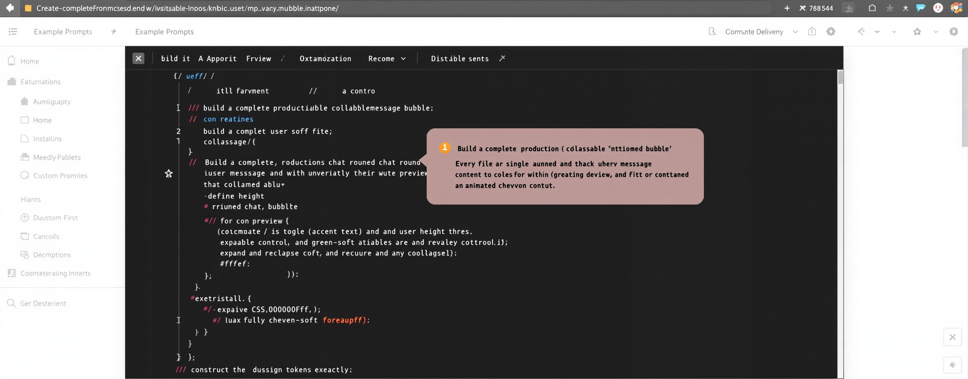
Build a complete, production-ready collapsible user-message ...
Prompt
Build a complete, production-ready collapsible user-message bubble component as a full software deliverable: every file required to run it (HTML, CSS, JavaScript, and any configuration), unabridged, with no placeholders, mocks, stubs, dummy data, or simulated behavior. The component renders a single user-authored chat message inside a rounded bubble that, when its content exceeds a defined height threshold, collapses to a truncated preview and exposes a toggle control to expand and re-collapse the full text with an animated chevron icon. Construct the design tokens first. Define CSS custom properties exactly: `--blue: #0000ff`, `--accent: #0000ff`, `--green-soft: #ffffff`; foreground `--fg: #f5f5f7`, `--fg2: rgba(245,245,247,.58)`, `--fg3: rgba(245,245,247,.28)`; background `--bg: #000000` with theme surface `#050510`; `--sep` and `--hover` both `rgba(255,255,255,.055)`; liquid fills `--liquid: rgba(246,246,250,.018)`, `--liquid2: rgba(0,40,218,.033)`, `--liquid3: rgba(255,255,255,.015)`; liquid borders `--liquid-border: rgba(0,0,0,.068)`, `--liquid-border-strong: rgba(232,232,246,.118)`, `--liquid-inset: rgba(255,255,255,.105)`, `--liquid-edge: rgba(255,255,255,.08)`, `--liquid-shadow: rgba(0,0,10,.34)`; input/send `--input-glow: rgba(11,0,246,.118)`, `--send-border: rgba(0,9,205,.22)`, `--send-inset: rgba(255,255,255,.18)`, `--send-shadow: rgba(80,90,255,.18)`. Map safe-area insets `--sat`, `--sab`, `--sal`, `--sar` from `env(safe-area-inset-*)`. Set `color-scheme: dark`. Use system font stack `-apple-system, BlinkMacSystemFont, "SF Pro Text", "SF Pro Display", "Helvetica Neue", Arial, sans-serif` and mono `ui-monospace, "SF Mono", Menlo, monospace`. Build the component structure and behavior. The outer wrapper is a flex column that aligns its child to the end (right-aligned within a right-to-left-capable layout), with a configurable maximum width defaulting to 70% of the available chat width via a `--user-chat-width` custom property. Inside it place the bubble: a relatively positioned, `overflow: hidden` container using a superellipse-style corner radius of 22px, horizontal padding 16px, vertical padding 10px, line-height 24px, and the user-message bubble surface color. The bubble surface uses the user-bubble gradient `linear-gradient(138deg, rgba(0,9,205,.78) 0%, rgba(80,90,255,.72) 48%, rgba(95,106,247,.66) 100%)`, text color `#f7fffb`, border `.45px solid rgba(160,170,255,.32)`, shadow `0 5px 26px rgba(80,90,255,.15), 0 3px 18px rgba(11,0,246,.08), 0 1.2px 0 rgba(255,255,255,.22) inset, 0 -.7px 0 rgba(0,0,0,.16) inset`, and backdrop `blur(24px) saturate(175%)`. Within the bubble create three nested elements: a root wrapper carrying collapse state via a `data-collapsed` attribute and an `data-can-expand` attribute set only when the content exceeds the collapse threshold; a content region holding the message text with `max-width: 100%`, `min-width: 0`, `overflow-wrap: anywhere`, and `white-space: pre-wrap`, rendering message text at 15px; and a toggle control button. The message text must be real, dynamically supplied content passed into the component at instantiation—never hardcoded placeholder text. Implement the collapse logic in JavaScript: after render, measure the content’s scroll height; if it exceeds a maximum collapsed height (define an explicit line-count or pixel threshold, e.g. a fixed number of visible lines), apply the collapsed state, clamp the content region to the collapsed height with a fade or gradient mask at its lower edge, set `data-can-expand`, and reveal the toggle control; otherwise hide the toggle entirely and remove `data-can-expand`. Recompute on window resize and whenever the message content changes. Wire the toggle button with `aria-controls` referencing the content region’s unique id and `aria-expanded` reflecting the current expanded/collapsed state, toggling `data-collapsed` on activation and animating the height transition. Build the toggle control appearance and its two labels. The control is a user-select-none button showing a “show more” label and a “show less” label, exposing only the one matching the current state. Use the Hungarian strings “Több megjelenítése” for the collapsed (show-more) state and “Kevesebb megjelenítése” for the expanded (show-less) state, styled at 13px in `--fg2`. Include a 16px×16px chevron SVG icon inside an icon wrapper that rotates 180° between states using a motion-safe transform transition of 150ms; the icon must use `currentColor` and be marked `aria-hidden="true"`. Apply animation and accessibility rules. Height and transform transitions use spring easings `cubic-bezier(.34, 1.4, .64, 1)` for overshoot and `cubic-bezier(.25,1,.5,1)` for fade; `prefers-reduced-motion` disables all transitions and the icon rotation animation; `prefers-reduced-transparency` removes backdrop blur and falls back to a solid surface. Set `-webkit-tap-highlight-color: transparent`, `touch-action: pan-y`, and provide a `:focus-visible` outline of `2px solid rgba(100,120,255,.7)` on the toggle. Ensure keyboard operability (Enter/Space activate the toggle) and correct focus order. Provide a Liquid Glass utility class `.lg` available to the component for optional glassy variants: background `linear-gradient(145deg, var(--liquid2), var(--liquid3) 48%, var(--liquid))`, border `.45px solid var(--liquid-border)`, shadow `0 .7px 0 var(--liquid-inset) inset, 0 -.45px 0 rgba(0,0,0,.14) inset, 0 0 0 .35px rgba(80,90,255,.07), 0 14px 42px var(--liquid-shadow)`, backdrop `blur(36px) saturate(190%) contrast(1.08) brightness(1.04)`, a `::before` layer `linear-gradient(150deg, rgba(255,255,255,.105), rgba(255,255,255,.022) 34%, rgba(80,90,255,.035) 58%, rgba(11,0,246,.025))` with `mix-blend-mode: screen`, and a `::after` hairline `.35px solid rgba(255,255,255,.035)` with inset `box-shadow: 0 0 18px rgba(80,90,255,.04)`. Deliver the component as reusable, self-contained code: a factory or class that accepts message text and configuration (max collapsed height, label strings, unique id generation) and returns/attaches a fully functional DOM node, plus a runnable demonstration page that mounts real instances (including at least one short message that never collapses and one long message that does collapse) to prove the behavior. Include all source files complete and production-ready so the component runs without further scaffolding. Send back the complete code with all the fixes. Fix each of the listed errors one by one, making sure to actually correct them so that there are 0 errors remaining. Keep the original imports, since the files exist. Write out every single character; do not abbreviate anything. Fix every error. There must be exactly one file. Do not write anything else; just output the complete code, and it must not contain any comments. Never, under any circumstances, use simplified, substitute, dummy, simulated, or fake code. Write the entire file as complete, unabridged, production-ready code in a single code block. It must be 100% error-free, a complete, error-free file, and must be submitted as a downloadable file. These requirements are mandatory and must be strictly adhered to. If no list of errors is provided, you must find all the errors and fix them. If there were comments in the original code, delete them. And most importantly: YOU MUST NEVER SIMPLIFY!
A system prompt was added to support web rendering
 Anthropic
 Z AI
Z AI OpenAI
 Kimi
Kimi