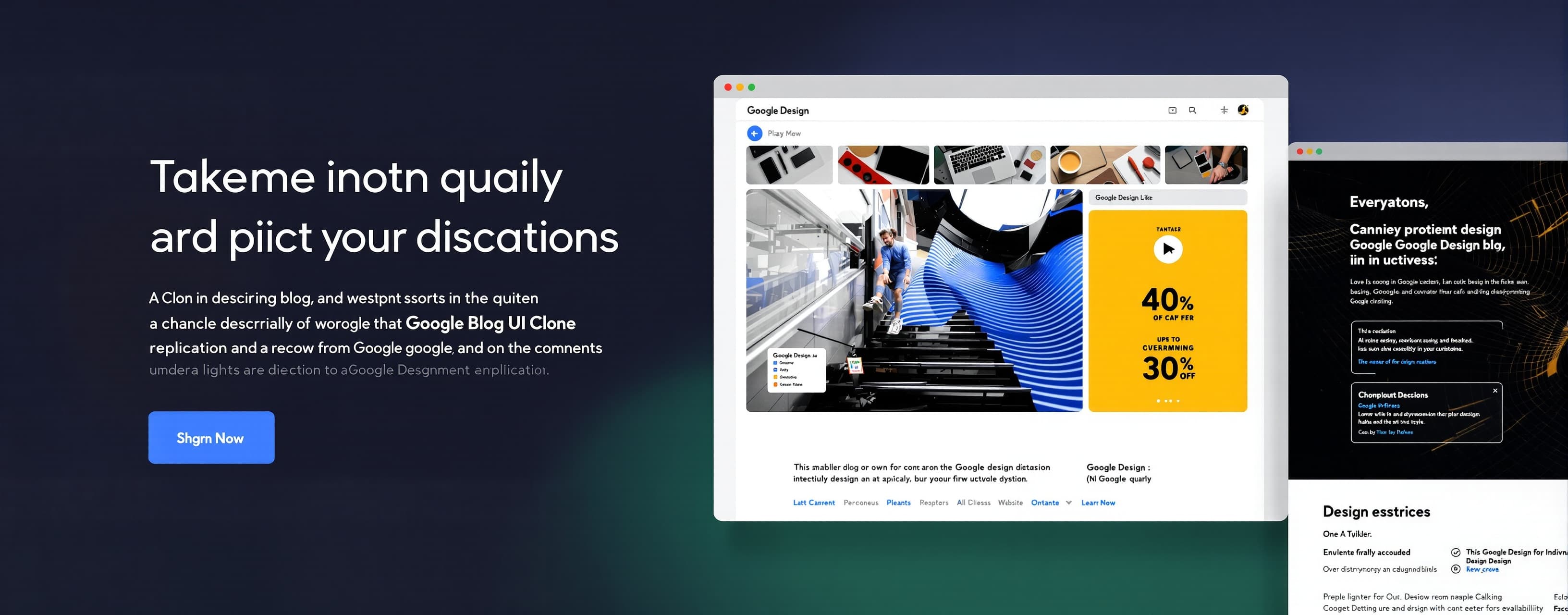
Google Design Blog UI Clone
A comprehensive UI/UX replication benchmark designed to evaluate AI models' ability to recreate complex, production-grade web interfaces with pixel-perfect accuracy. Models must clone the Google Design blog, demonstrating mastery of modern design systems, responsive layouts, interactive components, semantic HTML, and accessibility standards (WCAG 2.1 AA). Success metrics include visual fidelity (95%+ parity), functional interactivity (search, filters, hover states), responsive behavior across breakpoints, and code quality. This evaluation tests the intersection of design comprehension, front-end implementation, and user experience thinking.
Prompt
# CLONE THE GOOGLE DESIGN BLOG UI — PROFESSIONAL SPECIFICATION ## OBJECTIVE Create a pixel-perfect recreation of the Google Design blog interface (design.google) as a fully functional, interactive web application. This is a UI/UX replication exercise focused on visual accuracy, component structure, and user experience. ## DESIGN SYSTEM & VISUAL HIERARCHY ### Color Palette - **Primary Background**: #FFFFFF (white) or #F8F9FA (off-white for subtle contrast) - **Secondary Background**: #F3F3F3 (card backgrounds) - **Text Primary**: #202124 (Material Gray 900 — near black) - **Text Secondary**: #5F6368 (Material Gray 600) - **Accent Dividers**: #DADCE0 (Material Gray 200) - **Interactive States**: Subtle gray overlays (hover: #F8F9FA, active: #E8EAED) - **Category Tags**: - AI: #4285F4 (Google Blue) - Material Design: #EA4335 (Google Red) - Typography: #FBBC04 (Google Yellow) - UX: #34A853 (Google Green) - Perspectives: #A142F4 (Google Purple) ### Typography - **Font Family**: 'Google Sans', -apple-system, BlinkMacSystemFont, 'Segoe UI', sans-serif - **Headlines (H1)**: 32px, 600 weight, line-height 1.25 - **Subheadings (H2)**: 24px, 600 weight, line-height 1.3 - **Article Titles (Card)**: 18px, 500 weight, line-height 1.4 - **Body Text**: 16px, 400 weight, line-height 1.6, letter-spacing 0.5px - **Metadata (Category, Date)**: 12px, 500 weight, uppercase, letter-spacing 1px ### Spacing System (8px base) - Use multiples of 8px: 8, 16, 24, 32, 48, 64 - Container max-width: 1200px - Grid gap: 24px (3 columns desktop, 2 mobile, 1 tablet intermediate) - Card padding: 24px - Section margin-top: 48-64px ## UI STRUCTURE ### Header/Navigation - **Logo**: "Google Design" text-based (not image) - **Search Bar**: Full-width on mobile, condensed on desktop - Placeholder: "Search articles..." - Icon: magnifying glass (Material Icons style) - Border: 1px solid #DADCE0, border-radius: 4px - **Navigation Categories** (horizontal scroll on mobile, visible on desktop): - All, Spotlight, Perspectives, Guides, Podcasts, Conversations, AI, Material Design, Typography, UX, Career, Accessibility - Active state: text bold, underline 2px - Hover state: subtle background highlight ### Hero/Featured Section - Large featured article card (optional on some layouts) - Image: 100% width, aspect ratio 16:9, border-radius: 8px - Overlay with semi-transparent gradient (bottom to top) - Title overlaid on image, 28px bold white text, 24px from bottom ### Article Grid/Cards - **Card Design**: - Border: none - Background: white - Border-radius: 8px - Box-shadow: 0 1px 2px rgba(32, 33, 36, 0.08) (subtle) - Padding: 24px - Transition: all 0.2s ease (hover effect) - **Card Hover State**: - Box-shadow: 0 4px 12px rgba(32, 33, 36, 0.15) - Scale: 1.02 (subtle lift) - Cursor: pointer - **Card Content Structure** (top to bottom): 1. **Image Section**: - Width: 100%, aspect ratio varies (3:2 or 16:9) - Border-radius: 4px - Overflow: hidden - Margin-bottom: 16px 2. **Metadata Row**: - Display: flex, gap: 8px, align-items: center - Category tag: - Padding: 4px 8px - Border-radius: 4px - Background color by category - Text: 11px, 600 weight, uppercase, color: white - Content type label (Spotlight, Guide, Podcast, etc.): - 12px, 500 weight, gray - Margin-bottom: 12px 3. **Title**: - 18px, 500 weight - Color: #202124 - Line-height: 1.4 - Margin-bottom: 8px 4. **Description**: - 14px, 400 weight - Color: #5F6368 - Line-height: 1.6 - 2 lines max (text-overflow: ellipsis) - Margin-bottom: 16px - **Three-Column Grid Desktop**: - Cards displayed in equal-width columns - Gap: 24px between cards - Responsive: 2 columns tablet (1024px), 1 column mobile (<640px) ### Section Dividers - Full-width divider line: 1px solid #DADCE0 - Margin: 48px 0 (top/bottom) - Optional section title above: "Recent Articles", "Typography", "UX", etc. ### "Recent" Section Widget (Sidebar or Dedicated Area) - Shows latest 5-8 articles - Vertical list layout - Minimal cards (no image initially, image on hover) - 14px title, 12px gray metadata - Border-left: 3px solid colored based on category ### Filters/Category Sidebar (Optional, if horizontal nav insufficient) - Sticky sidebar on desktop - Accordion-style on mobile - Categories grouped: Content Types, Topics - Checkbox-style filters (unchecked circle, filled circle when selected) - "Clear all" link at bottom - Smooth transitions on filter change ### Footer - Background: #F8F9FA - Max-width: 1200px - Padding: 48px 24px - 3-4 columns: About, Resources, Legal, Social - Links: 14px, color: #5F6368 - Copyright text: 12px, gray - Divider line above: 1px solid #DADCE0 ## IMAGE TREATMENT ### Image Styles by Type - **Illustrations/Vectors**: - Full color, no filters - Typically feature geometric shapes, gradients (subtle) - Examples: code icons, UI mockups, abstract shapes - Border-radius: 4px - **Photography**: - Slight vignette or overlay (optional) - Warm, neutral, or cool tone depending on topic - Sometimes desaturated or boosted contrast for cohesion - No harsh shadows or overly bright areas - **Animated/Dynamic Imagery**: - Represented as stills in static view - Indicated by "Play" icon overlay (subtle, centered) - 24px play icon, white, 30% opacity - **Dark-themed Content**: - Some cards feature dark backgrounds (#1F2937 or #111827) - Used for AI-related or "futuristic" articles - Text remains readable (white/light gray) ## INTERACTIONS & MICRO-INTERACTIONS ### Hover Effects - **Cards**: subtle elevation + shadow deepening - **Links**: underline appears or color shifts - **Category Tags**: slight background color shift - **Search**: border color changes to #4285F4 on focus ### Loading States - Skeleton loaders for article cards (optional) - Subtle pulse animation on image placeholders ### Responsive Behavior - **Mobile (<640px)**: - Single column grid - Hamburger menu for categories (collapsible) - Search always visible, full-width - Reduced padding: 16px instead of 24px - **Tablet (640px - 1024px)**: - 2-column grid - Categories visible but condensed - Padding: 20px - **Desktop (>1024px)**: - 3-column grid (or 2-column if sidebar present) - Full navigation visible - Standard padding: 24px ## SPECIFIC ARTICLE EXAMPLES TO RECREATE 1. **"Code is a Design Material"** - Image: Cursor + vector grid background, green-blue gradient - Category: UX - Type: Perspective - Description: "A designer's reflections from Config, and why UX fundamentals matter more than ever" 2. **"Designing for Transparent Screens"** - Image: XR glasses POV with multiple UI screens composited - Category: UX - Type: Spotlight - Description: "Behind the scenes of Jetpack Compose Glimmer, our new design system for display AI glasses" 3. **"Illustrating the Gemini App"** - Image: Grid of 8 dark tiles with pulsing gradients and glowing UI elements - Category: AI - Type: Spotlight - Description: "How dynamic cues help users discover, learn, and master our AI assistant's evolving features" 4. **"Making Google Sans Flex"** - Image: Bold typography showcase, typeface variations - Category: Typography - Type: Spotlight - Description: "How seven design problems shaped Google's iconic typeface — from inception to going open source" 5. **"True Design Is Better Than New Design"** - Image: Portrait or abstract design-related visual - Category: Perspectives - Type: Podcast - Description: "David Reinfurt discusses how individual perspective is the real driver of a design practice" ## TECHNICAL REQUIREMENTS - **Framework**: React, Vue, or vanilla HTML/CSS/JS (model's choice) - **Responsiveness**: Mobile-first approach, tested at 375px, 768px, 1024px, 1440px - **Accessibility**: WCAG 2.1 AA compliance - Proper heading hierarchy (H1, H2, etc.) - ARIA labels on interactive elements - Color contrast: 4.5:1 minimum - Keyboard navigation support - Focus indicators visible - **Performance**: - Images lazy-loaded below the fold - CSS-in-JS or external stylesheet (no inline) - Optimize for Core Web Vitals (LCP < 2.5s, FID < 100ms, CLS < 0.1) - **Browser Support**: - Chrome (latest) - Firefox (latest) - Safari (latest) - Edge (latest) ## CONTENT GENERATION RULES - If generating placeholder content, ensure descriptions are insightful and thematically relevant - Article titles should be compelling 6-8 word headlines - Category tags must be from the defined list - Dates should be realistic and in descending order (newest first) - Metadata should feel authentic (author optional, category always present) ## DESIGN PHILOSOPHY Google Design blog embodies these principles: 1. **Minimalism**: Every element serves a purpose. Remove visual noise. 2. **Content-First**: Typography and white space guide the eye to content. 3. **Accessibility**: Inclusive design is not optional. WCAG compliance mandatory. 4. **Modern Professional**: Sophisticated, not corporate. Approachable, not casual. 5. **Google Brand**: Leverage Google's design language (Material Design foundations) without feeling templated. ## DELIVERABLES Provide: 1. ✅ **Fully functional HTML/CSS/JavaScript** (or framework equivalent) 2. ✅ **Responsive design** tested at 3+ breakpoints 3. ✅ **At least 12+ article cards** with varied content types 4. ✅ **Working search functionality** (client-side filtering) 5. ✅ **Interactive category filters** (with visual state changes) 6. ✅ **Hover/focus states** on all interactive elements 7. ✅ **Dark mode toggle** (bonus: optional light/dark theme switcher) 8. ✅ **Code comments** explaining key CSS/JS decisions 9. ✅ **Accessibility audit** (keyboard nav, screen reader compatibility) ## SUCCESS CRITERIA - Visual parity with Google Design blog at 95%+ accuracy - All interactive elements functional and intuitive - Zero layout shifts or jank on scroll/resize - Load all content within 2 seconds (simulated) - Perfect Lighthouse accessibility score (90+) - Code is clean, semantic, and maintainable --- **NOW BUILD IT. SHOW YOUR BEST WORK.**
A system prompt was added to support web rendering


